

3 selected sticky notes with shadows created with HTML/CSS
We have put together design snippets of "sticky note boxes" that can be used as notes or supplements. By adding shadows, we have made the design more similar to real-world sticky notes. By the way, although its uses are limited, it is particularly compatible with cute sites. You can install it just by copying and pasting, and you can also customize the colors, so please have fun and try differentiating yourself from other sites.
Oblong Type

Monochromatic
Adjust design
Copy HTML
<div class="fusen-1">おしゃれな付箋デザイン</div>
Copy CSS
          .fusen-1 {
    display: inline-block;
    position: relative;
    padding: .5em 1.3em .5em 1em;
    background-color: #a9ceec;
    color: #333333;
}

.fusen-1::before {
    position: absolute;
    bottom: -1px;
    right: 9px;
    z-index: -1;
    transform: rotate(5deg);
    width: 70%;
    height: 50%;
    background-color: #d0d0d0;
    content: "";
    filter: blur(4px);
}

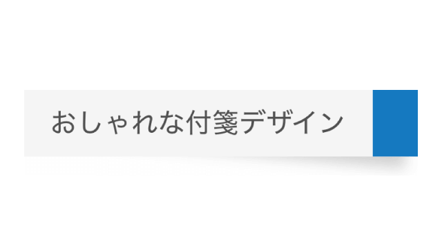
With tip color
Adjust design
Copy HTML
<div class="fusen-2">おしゃれな付箋デザイン</div>
Copy CSS
          .fusen-2 {
    display: inline-block;
    position: relative;
    padding: .5em 1em;
    border-right: 27px solid #2589d0;
    background-color: #f5f5f5;
    color: #333333;
}

.fusen-2::before {
    position: absolute;
    bottom: 2px;
    right: -20px;
    z-index: -1;
    transform: rotate(5deg);
    width: 100%;
    height: 50%;
    background-color: #d0d0d0;
    content: "";
    filter: blur(4px);
}
Square Type

Monochromatic
Adjust design
Copy HTML
          <div class="fusen-3">
    おしゃれな付箋デザイン
    おしゃれな付箋デザイン
    おしゃれな付箋デザイン
    おしゃれな付箋デザイン
</div>
Copy CSS
          .fusen-3 {
    display: flex;
    align-items: center;
    position: relative;
    width: 240px;
    height: 240px;
    padding: 2em 2.2em;
    background-color: #a9ceec;
    color: #333333;
}

.fusen-3::before {
    position: absolute;
    bottom: -5px;
    right: 7px;
    z-index: -1;
    transform: rotate(5deg);
    width: 70%;
    height: 50%;
    background-color: #d0d0d0;
    content: "";
    filter: blur(4px);
}