


HTML・CSSでつくるツールチップのデザイン5選
HTML・CSSでつくるツールチップのデザインをまとめました。クリックで非表示を切り替えるものや吹き出し風・アニメーション付きのものまで、どれもコピペで再現することが可能です。
テキストから出るツールチップ
上向き
デザインを調整する
HTMLをコピペする
          <div class="tooltip-001">
    <div>マウスホバーしてください</div>
    <span>ツールチップの内容</span>
</div>
CSSをコピペする
          .tooltip-001 {
    display: inline-block;
    position: relative;
}

.tooltip-001 > div {
    cursor: pointer;
}

.tooltip-001 > span {
    display: flex;
    justify-content: center;
    visibility: hidden;
    opacity: 0;
    position: absolute;
    bottom: -40px;
    left: 50%;
    transform: translateX(-50%);
    padding: .5em 1em;
    border-radius: 3px;
    background-color: #2589d0;
    color: #ffffff;
    font-size: .7em;
    white-space: nowrap;
    transition: opacity .3s;
}

.tooltip-001 > span::before {
    position: absolute;
    top: -6px;
    width: 9px;
    height: 6px;
    background-color: inherit;
    clip-path: polygon(50% 0, 0 100%, 100% 100%);
    content: '';
}

.tooltip-001:hover > span {
    visibility: visible;
    opacity: 1;
}
下向き
デザインを調整する
HTMLをコピペする
          <div class="tooltip-002">
    <div>マウスホバーしてください</div>
    <span>ツールチップの内容</span>
</div>
CSSをコピペする
          .tooltip-002 {
    display: inline-block;
    position: relative;
}

.tooltip-002 > div {
    cursor: pointer;
}

.tooltip-002 > span {
    display: flex;
    justify-content: center;
    visibility: hidden;
    opacity: 0;
    position: absolute;
    top: -40px;
    left: 50%;
    transform: translateX(-50%);
    padding: .5em 1em;
    border-radius: 3px;
    background-color: #2589d0;
    color: #ffffff;
    font-size: .7em;
    white-space: nowrap;
    transition: opacity .3s;
}

.tooltip-002 > span::before {
    position: absolute;
    bottom: -6px;
    width: 9px;
    height: 6px;
    background-color: inherit;
    clip-path: polygon(0 0, 100% 0, 50% 100%);
    content: '';
}

.tooltip-002:hover > span {
    visibility: visible;
    opacity: 1;
}
左向き
デザインを調整する
HTMLをコピペする
          <div class="tooltip-003">
    <div>マウスホバーしてください</div>
    <span>ツールチップの内容</span>
</div>
CSSをコピペする
          .tooltip-003 {
    display: inline-block;
    position: relative;
}

.tooltip-003 > div {
    cursor: pointer;
}

.tooltip-003 > span {
    display: flex;
    align-items: center;
    visibility: hidden;
    opacity: 0;
    position: absolute;
    top: 50%;
    right: -150px;
    transform: translateY(-50%);
    padding: .5em 1em;
    border-radius: 3px;
    background-color: #2589d0;
    color: #fff;
    font-size: .7em;
    white-space: nowrap;
    transition: opacity .3s;
}

.tooltip-003 > span::before {
    position: absolute;
    left: -6px;
    width: 6px;
    height: 9px;
    background-color: inherit;
    clip-path: polygon(0 50%, 100% 0, 100% 100%);
    content: '';
}

.tooltip-003:hover > span {
    visibility: visible;
    opacity: 1;
}

右向き
デザインを調整する
HTMLをコピペする
          <div class="tooltip-004">
    <div>マウスホバーしてください</div>
    <span>ツールチップの内容</span>
</div>
CSSをコピペする
          .tooltip-004 {
    display: inline-block;
    position: relative;
}

.tooltip-004 > div {
    cursor: pointer;
}

.tooltip-004 > span {
    display: flex;
    align-items: center;
    visibility: hidden;
    opacity: 0;
    position: absolute;
    top: 50%;
    left: -140px;
    transform: translateY(-50%);
    padding: .5em 1em;
    border-radius: 3px;
    background-color: #2589d0;
    color: #fff;
    font-size: .7em;
    white-space: nowrap;
    transition: opacity .3s;
}

.tooltip-004 > span::before {
    position: absolute;
    right: -6px;
    width: 6px;
    height: 9px;
    background-color: inherit;
    clip-path: polygon(0 0, 100% 50%, 0 100%);
    content: '';
}

.tooltip-004:hover > span {
    visibility: visible;
    opacity: 1;
}
アイコンから出るツールチップ
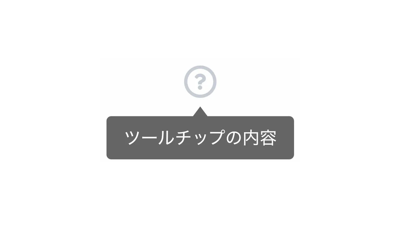
クエスチョンマーク
デザインを調整する
HTMLをコピペする
          <div class="tooltip-005">
    <svg xmlns="http://www.w3.org/2000/svg" viewBox="0 0 24 24">
        <path d="M12 22C6.47715 22 2 17.5228 2 12C2 6.47715 6.47715 2 12 2C17.5228 2 22 6.47715 22 12C22 17.5228 17.5228 22 12 22ZM11 15V17H13V15H11ZM13 13.3551C14.4457 12.9248 15.5 11.5855 15.5 10C15.5 8.067 13.933 6.5 12 6.5C10.302 6.5 8.88637 7.70919 8.56731 9.31346L10.5288 9.70577C10.6656 9.01823 11.2723 8.5 12 8.5C12.8284 8.5 13.5 9.17157 13.5 10C13.5 10.8284 12.8284 11.5 12 11.5C11.4477 11.5 11 11.9477 11 12.5V14H13V13.3551Z"
              fill="#d0d0d0"></path>
    </svg>
    <p>ツールチップの内容</p>
</div>
CSSをコピペする
          .tooltip-005 {
    display: inline-block;
    position: relative;
}

.tooltip-005 svg {
    width: 1.5rem;
    height: 1.5rem;
    cursor: pointer;
}

.tooltip-005 p {
    display: flex;
    justify-content: center;
    visibility: hidden;
    opacity: 0;
    position: absolute;
    bottom: -43px;
    left: 50%;
    transform: translateX(-50%);
    padding: .5em 1em;
    border-radius: 3px;
    background-color: #00000099;
    color: #fff;
    font-size: .7em;
    white-space: nowrap;
    transition: opacity .3s;
}

.tooltip-005:hover > p {
    visibility: visible;
    opacity: 1;
}

.tooltip-005 p::before {
    position: absolute;
    top: -6px;
    width: 9px;
    height: 6px;
    background-color: inherit;
    clip-path: polygon(50% 0, 0 100%, 100% 100%);
    content: '';
}