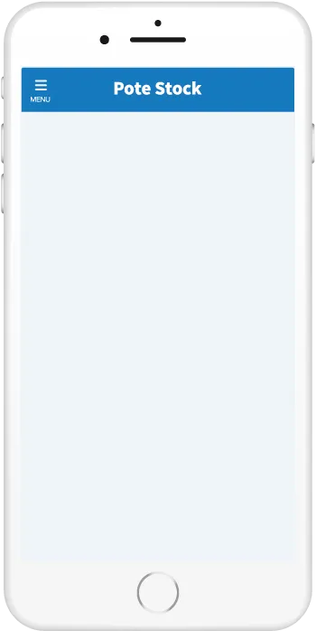
HTML・CSSで作るトグルボタンのデザイン4選
ON・OFFという2つの状態を切り替えられるトグルボタンの、JavaScript不要かつHTML・CSSのみで作れるデザインをまとめました。iOSでよく見るものから文字ありのものまで、どれもコピペで取り入れることが可能です。
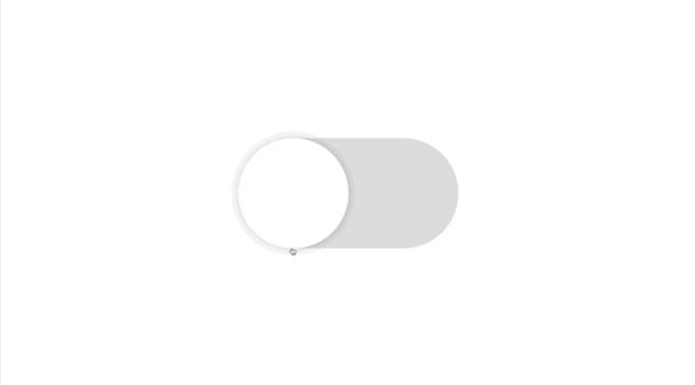
シンプルなトグルボタン
iOS風
デザインを調整する
iOSで採用されているトグルボタンを再現してみました。ラベルを置く場合、ユーザーの視線移動を考慮して左側に置くのがおすすめです。
HTMLをコピペする
          <label class="toggle-button-1">
    <input type="checkbox"/>
</label>
CSSをコピペする
          .toggle-button-1 {
    display: inline-block;
    position: relative;
    width: 100px;
    height: 50px;
    border-radius: 50px;
    background-color: #dddddd;
    cursor: pointer;
    transition: background-color .4s;
}

.toggle-button-1:has(:checked) {
    background-color: #4bd865;
}

.toggle-button-1::after {
    position: absolute;
    top: 0;
    left: 0;
    width: 50px;
    height: 50px;
    border-radius: 50%;
    box-shadow: 0 0 5px rgb(0 0 0 / 20%);
    background-color: #fff;
    content: '';
    transition: left .4s;
}

.toggle-button-1:has(:checked)::after {
    left: 50px;
}

.toggle-button-1 input {
    display: none;
}
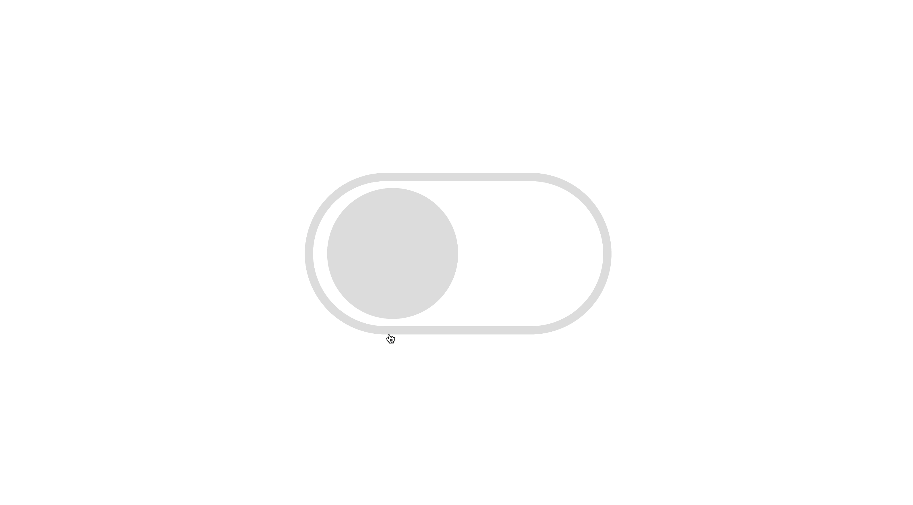
iOS風(縁あり)
デザインを調整する
HTMLをコピペする
          <label class="toggle-button-2">
    <input type="checkbox"/>
</label>
CSSをコピペする
          .toggle-button-2 {
    display: inline-block;
    position: relative;
    width: 100px;
    height: 50px;
    border-radius: 50px;
    border: 3px solid #dddddd;
    box-sizing: content-box;
    cursor: pointer;
    transition: border-color .4s;
}

.toggle-button-2:has(:checked) {
    border-color: #4bd865;
}

.toggle-button-2::after {
    position: absolute;
    top: 50%;
    left: 5px;
    transform: translateY(-50%);
    width: 45px;
    height: 45px;
    border-radius: 50%;
    background-color: #dddddd;
    content: '';
    transition: left .4s;
}

.toggle-button-2:has(:checked)::after {
    left: 50px;
    background-color: #4bd865;
}

.toggle-button-2 input {
    display: none;
}
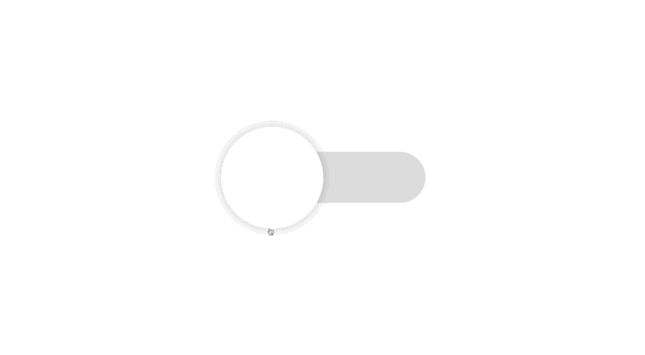
iOS風(背景細め)
デザインを調整する
HTMLをコピペする
          <label class="toggle-button-3">
    <input type="checkbox"/>
</label>
CSSをコピペする
          .toggle-button-3 {
    display: flex;
    align-items: center;
    position: relative;
    width: 100px;
    height: 25px;
    margin-top: 12.5px;
    border-radius: 50px;
    background-color: #dddddd;
    cursor: pointer;
    transition: background-color .4s;
}

.toggle-button-3:has(:checked) {
    background-color: #4bd865;
}

.toggle-button-3::after {
    position: absolute;
    left: 0;
    width: 50px;
    height: 50px;
    border-radius: 50%;
    box-shadow: 0 0 5px rgb(0 0 0 / 20%);
    background: #fff;
    content: '';
    transition: left .4s;
}

.toggle-button-3:has(:checked)::after {
    left: 50px;
}

.toggle-button-3 input {
    display: none;
}
文字付きのトグルボタン
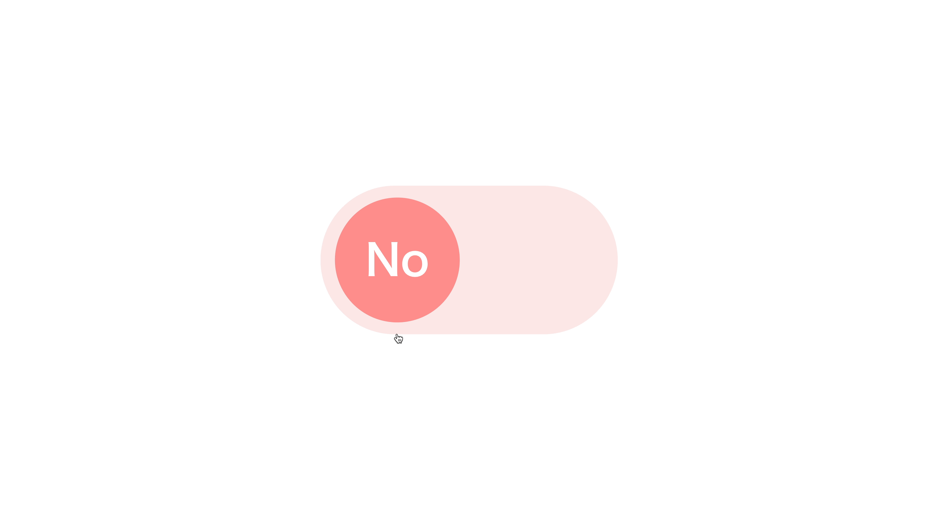
Yes/No
デザインを調整する
HTMLをコピペする
          <label class="toggle-button-4">
    <input type="checkbox"/>
</label>
CSSをコピペする
          .toggle-button-4 {
    display: flex;
    align-items: center;
    position: relative;
    width: 100px;
    height: 50px;
    border-radius: 50px;
    box-sizing: content-box;
    background-color: #ff8d8d33;
    cursor: pointer;
    transition: background-color .4s;
}

.toggle-button-4:has(:checked) {
    background-color: #75bbff33;
}

.toggle-button-4::before {
    position: absolute;
    left: 5px;
    width: 42px;
    height: 42px;
    border-radius: 50%;
    background-color: #ff8d8d;
    content: '';
    transition: left .4s;
}

.toggle-button-4:has(:checked)::before {
    left: 50px;
    background-color: #75bbff;
}

.toggle-button-4::after {
    position: absolute;
    left: 26px;
    transform: translateX(-50%);
    color: #fff;
    font-weight: 600;
    font-size: .9em;
    content: 'No';
    transition: left .4s;
}

.toggle-button-4:has(:checked)::after {
    left: 71px;
    content: 'Yes';
}

.toggle-button-4 input {
    display: none;
}