HTML・CSSでつくるおしゃれなタイムラインのデザイン1選
記事内での手順紹介や会社の沿革などを表現するのに適したタイムライン。今回はそんなタイムラインの、HTML・CSSのみでの作り方・デザインをまとめました。もちろんどれもレスポンシブ対応で、縦軸のものから横軸のものまでどれもコピペで再現することが可能です。
横方向のタイムライン
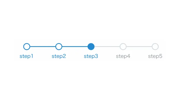
ステップバー
デザインを調整する
当サイトでも使用している、ナビゲーションとして設置するのに適したタイムライン。ユーザー登録や商品購入などのフローを分かりやすく可視化することができます。ちなみにアクティブ化するには、現在のステップの項目に「current」クラスを、それ以前の項目に「prev」を付けてあげる必要があります。
HTMLをコピペする
          <ol class="timeline-003">
    <li class="prev">step1</li>
    <li class="prev">step2</li>
    <li class="current">step3</li>
    <li>step4</li>
    <li>step5</li>
</ol>
CSSをコピペする
          .timeline-003 {
    display: flex;
    justify-content: center;
    list-style-type: none;
    padding: 0;
}

.timeline-003 li {
    display: flex;
    flex: 1 1;
    flex-direction: column;
    align-items: center;
    position: relative;
    z-index: 1;
    color: #969da3;
    font-size: .8em;
}

.timeline-003 li.prev,
.timeline-003 li.current {
    color: #2589d0;
}

.timeline-003 li::before {
    display: inline-block;
    width: 14px;
    height: 14px;
    margin-bottom: 6px;
    content: '';
    border: 2px solid #d6dde3;
    border-radius: 50%;
    background-color: #fff;
}

.timeline-003 li.prev::before,
.timeline-003 li.current::before {
    border-color: #2589d0;
}

.timeline-003 li:not(:last-child)::after {
    position: absolute;
    top: 8px;
    left: 50%;
    z-index: -1;
    width: 100%;
    height: 2px;
    background-color: #d6dde3;
    content: '';
}

.timeline-003 li.current::before,
.timeline-003 li.prev::after {
    background-color: #2589d0;
}