


HTML・CSSでつくるセレクトボックスのデザイン6選
フォームとして沢山の選択肢を表示するのに最適なセレクトボックス。今回はそんなセレクトボックス(プルダウン)のおしゃれなデザインをまとめました。どれもコピペだけで再現できるものなのでぜひ取り入れてみてください。
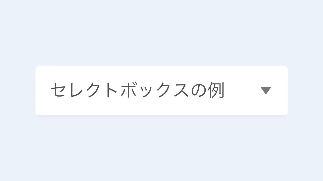
シンプルなセレクトボックス
スタンダード
デザインを調整する
HTMLをコピペする
          <label class="selectbox-3">
    <select>
        <option>optionの例1</option>
        <option>optionの例2</option>
        <option>optionの例3</option>
    </select>
</label>
CSSをコピペする
          .selectbox-3 {
    display: inline-flex;
    align-items: center;
    position: relative;
}

.selectbox-3::after {
    position: absolute;
    right: 15px;
    width: 10px;
    height: 7px;
    background-color: #535353;
    clip-path: polygon(0 0, 100% 0, 50% 100%);
    content: '';
    pointer-events: none;
}

.selectbox-3 select {
    appearance: none;
    min-width: 230px;
    height: 2.8em;
    padding: .4em calc(.8em + 30px) .4em .8em;
    border: 1px solid #d0d0d0;
    border-radius: 3px;
    background-color: #fff;
    color: #333333;
    font-size: 1em;
    cursor: pointer;
}
矢印2つ
デザインを調整する
HTMLをコピペする
          <label class="selectbox-6">
    <select>
        <option>optionの例1</option>
        <option>optionの例2</option>
        <option>optionの例3</option>
    </select>
</label>
CSSをコピペする
          .selectbox-6 {
    position: relative;
}

.selectbox-6::before,
.selectbox-6::after {
    position: absolute;
    right: 15px;
    width: 9px;
    height: 6px;
    background-color: #535353;
    content: '';
    pointer-events: none;
}

.selectbox-6::before {
    top: calc(50% - 9px);
    clip-path: polygon(50% 0, 100% 100%, 0 100%);
}

.selectbox-6::after {
    bottom: calc(50% - 9px);
    clip-path: polygon(0 0, 50% 100%, 100% 0);
}

.selectbox-6 select {
    appearance: none;
    min-width: 230px;
    height: 2.8em;
    padding: .4em calc(.8em + 30px) .4em .8em;
    border: 1px solid #d0d0d0;
    border-radius: 3px;
    background-color: #fff;
    color: #333333;
    font-size: 1em;
    cursor: pointer;
}
下線あり
デザインを調整する
HTMLをコピペする
          <label class="selectbox-5">
    <select>
        <option>optionの例1</option>
        <option>optionの例2</option>
        <option>optionの例3</option>
    </select>
</label>
CSSをコピペする
          .selectbox-5 {
    display: inline-flex;
    align-items: center;
    position: relative;
}

.selectbox-5::after {
    position: absolute;
    right: 15px;
    width: 10px;
    height: 7px;
    background-color: #535353;
    clip-path: polygon(0 0, 100% 0, 50% 100%);
    content: '';
    pointer-events: none;
}

.selectbox-5 select {
    appearance: none;
    min-width: 230px;
    height: 2.8em;
    padding: .4em calc(.8em + 30px) .4em .8em;
    border: none;
    border-bottom: 2px solid #d0d0d0;
    background-color: #fff;
    color: #333333;
    font-size: 1em;
    cursor: pointer;
}

.selectbox-5 select:focus {
    outline: none;
}
白背景 & シャドウ
デザインを調整する
HTMLをコピペする
          <label class="selectbox-4">
    <select>
        <option>optionの例1</option>
        <option>optionの例2</option>
        <option>optionの例3</option>
    </select>
</label>
CSSをコピペする
          .selectbox-4 {
    display: inline-flex;
    align-items: center;
    position: relative;
}

.selectbox-4::after {
    position: absolute;
    right: 15px;
    width: 10px;
    height: 7px;
    background-color: #535353;
    clip-path: polygon(0 0, 100% 0, 50% 100%);
    content: '';
    pointer-events: none;
}

.selectbox-4 select {
    appearance: none;
    min-width: 230px;
    height: 2.8em;
    padding: .4em calc(.8em + 30px) .4em .8em;
    border: none;
    border-radius: 3px;
    box-shadow: 0 4px 4px rgb(0 0 0 / 2%), 0 2px 3px -2px rgba(0 0 0 / 5%);
    background-color: #fff;
    color: #333333;
    font-size: 1em;
    cursor: pointer;
}
カラフルなセレクトボックス

フラットデザイン
デザインを調整する
HTMLをコピペする
          <label class="selectbox-1">
    <select>
        <option>optionの例1</option>
        <option>optionの例2</option>
        <option>optionの例3</option>
    </select>
</label>
CSSをコピペする
          .selectbox-1 {
    position: relative;
}

.selectbox-1::before,
.selectbox-1::after {
    position: absolute;
    content: '';
    pointer-events: none;
}

.selectbox-1::before {
    display: inline-block;
    right: 0;
    width: 2.8em;
    height: 2.8em;
    border-radius: 0 3px 3px 0;
    background-color: #2589d0;
}

.selectbox-1::after {
    position: absolute;
    top: 50%;
    right: 1.4em;
    transform: translate(50%, -50%) rotate(45deg);
    width: 6px;
    height: 6px;
    border-bottom: 3px solid #fff;
    border-right: 3px solid #fff;
}

.selectbox-1 select {
    appearance: none;
    min-width: 230px;
    height: 2.8em;
    padding: .4em 3.6em .4em .8em;
    border: none;
    border-radius: 3px;
    background-color: #f2f2f2;
    color: #333;
    font-size: 1em;
    cursor: pointer;
}

.selectbox-1 select:focus {
    outline: 2px solid #2589d0;
}

枠線あり
デザインを調整する
HTMLをコピペする
          <label class="selectbox-2">
    <select>
        <option>optionの例1</option>
        <option>optionの例2</option>
        <option>optionの例3</option>
    </select>
</label>
CSSをコピペする
          .selectbox-2 {
    position: relative;
}

.selectbox-2::before,
.selectbox-2::after {
    position: absolute;
    content: '';
    pointer-events: none;
}

.selectbox-2::before {
    right: 0;
    display: inline-block;
    width: 2.8em;
    height: 2.8em;
    border-radius: 0 3px 3px 0;
    background-color: #2589d0;
    content: '';
}

.selectbox-2::after {
    position: absolute;
    top: 50%;
    right: 1.4em;
    transform: translate(50%, -50%) rotate(45deg);
    width: 6px;
    height: 6px;
    border-bottom: 3px solid #fff;
    border-right: 3px solid #fff;
    content: '';
}

.selectbox-2 select {
    appearance: none;
    -webkit-appearance: none;
    -moz-appearance: none;
    min-width: 230px;
    height: 2.8em;
    padding: .4em 3.6em .4em .8em;
    border: 2px solid #2589d0;
    border-radius: 3px;
    color: #333333;
    font-size: 1em;
    cursor: pointer;
}

.selectbox-2 select:focus {
    outline: 1px solid #2589d0;
}