

HTML・CSSのみでつくる「続きを読む」ボタンのデザイン4選
長い文章を省略してユーザーが自由に開閉して読めるようにしたい、という時ありますよね。そんな時によく使われる「続きを読む」ボタンのスニペットをまとめました。三点リーダー・グラデーション付きのものやアコーディオンのように開閉できるものまで、どれもコピペで実装することが可能です。
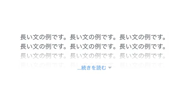
高さで制限する
リンク風
デザインを調整する
HTMLをコピペする
          <div class="read-more-1">
    <p>
        「CSS Stock」はWeb制作の「これが欲しい」を叶える、をテーマにHTML・CSSのデザインやパーツをご紹介するサイトです。
        お好きなパーツを選び、デザインや色を調整するだけ。あとはHTMLやCSSをコピペすれば、コーディング要らずでサイトに取り入れることができます。
        ちなみにどのコードにおいても、自由にご自身のWebサイトやブログで使用いただいて構いません。もちろんオリジナルにカスタマイズしてご使用いただいても大丈夫です。
    </p>
    <label>
        <input type="checkbox"/>
        ...続きを読む
    </label>
</div>
CSSをコピペする
          .read-more-1 {
    position: relative;
}

.read-more-1 p {
    position: relative;
    max-height: 100px; /* 開く前に見せたい高さを指定 */
    margin-bottom: 0;
    overflow: hidden;
    transition: max-height 1s;
}

.read-more-1:has(:checked) p {
    max-height: 100vh;
}

.read-more-1 p::after {
    display: block;
    position: absolute;
    left: 0;
    bottom: 0;
    width: 100%;
    height: 60px;
    background: linear-gradient(180deg, hsla(0, 0%, 100%, 0) 0, hsla(0, 0%, 100%, .9) 50%, hsla(0, 0%, 100%, .9) 0, #fff);
    content: '';
}

.read-more-1:has(:checked) p::after {
    content: none;
}

.read-more-1 label {
    display: flex;
    align-items: center;
    gap: 0 4px;
    position: absolute;
    bottom: 0;
    left: 50%;
    transform: translateX(-50%);
    color: #4f96f6;
    font-size: .8em;
}

.read-more-1 label:hover {
    color: #c7511f;
    text-decoration: underline;
    cursor: pointer;
}

.read-more-1:has(:checked) label {
    display: none;
}

.read-more-1 label::after {
    display: inline-block;
    width: 10px;
    height: 5px;
    background-color: #b6bdc3;
    clip-path: polygon(0 0, 100% 0, 50% 100%);
    content: '';
}

.read-more-1 input {
    display: none;
}
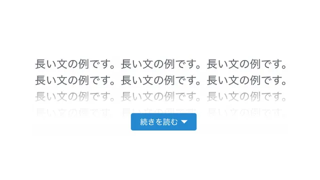
ボタン風
デザインを調整する
HTMLをコピペする
          <div class="read-more-3">
    <p>
        「CSS Stock」はWeb制作の「これが欲しい」を叶える、をテーマにHTML・CSSのデザインやパーツをご紹介するサイトです。
        お好きなパーツを選び、デザインや色を調整するだけ。あとはHTMLやCSSをコピペすれば、コーディング要らずでサイトに取り入れることができます。
        ちなみにどのコードにおいても、自由にご自身のWebサイトやブログで使用いただいて構いません。もちろんオリジナルにカスタマイズしてご使用いただいても大丈夫です。
    </p>
    <label>
        <input type="checkbox"/>
        続きを読む
    </label>
</div>
CSSをコピペする
          .read-more-3 {
    position: relative;
}

.read-more-3 p {
    position: relative;
    max-height: 100px; /* 開く前に見せたい高さを指定 */
    margin-bottom: 10px;
    overflow: hidden;
    transition: max-height 1s;
}

.read-more-3:has(:checked) p {
    max-height: 100vh;
}

.read-more-3 p::after {
    display: block;
    position: absolute;
    left: 0;
    bottom: 0;
    width: 100%;
    height: 60px;
    background: linear-gradient(180deg, hsla(0, 0%, 100%, 0) 0, hsla(0, 0%, 100%, .9) 50%, hsla(0, 0%, 100%, .9) 0, #fff);
    content: '';
}

.read-more-3:has(:checked) p::after {
    content: none;
}

.read-more-3 label {
    display: flex;
    align-items: center;
    gap: 0 4px;
    position: absolute;
    bottom: 0;
    left: 50%;
    transform: translateX(-50%);
    padding: .4em 1.2em;
    border-radius: 1px;
    background-color: #2589d0;
    color: #fff;
    font-size: .7em;
}

.read-more-3 label:hover {
    border:1px solid #2589d0;
    background-color: #fff;
    color: #2589d0;
    cursor: pointer;
}

.read-more-3:has(:checked) label {
    display: none;
}

.read-more-3 label::after {
    display: inline-block;
    width: 10px;
    height: 5px;
    background-color: #fff;
    clip-path: polygon(0 0, 100% 0, 50% 100%);
    content: '';
}

.read-more-3 label:hover::after{
    background-color: #2589d0;
}

.read-more-3 input {
    display: none;
}
行数で制限する
リンク風
デザインを調整する
HTMLをコピペする
          <div class="read-more-2">
    <p>
        「CSS Stock」はWeb制作の「これが欲しい」を叶える、をテーマにHTML・CSSのデザインやパーツをご紹介するサイトです。
        お好きなパーツを選び、デザインや色を調整するだけ。あとはHTMLやCSSをコピペすれば、コーディング要らずでサイトに取り入れることができます。
        ちなみにどのコードにおいても、自由にご自身のWebサイトやブログで使用いただいて構いません。もちろんオリジナルにカスタマイズしてご使用いただいても大丈夫です。
    </p>
    <label>
        <input type="checkbox"/>
        ...続きを読む
    </label>
</div>
CSSをコピペする
          .read-more-2 {
    position: relative;
}

.read-more-2 p {
    display: -webkit-box;
    position: relative;
    margin-bottom: 0;
    overflow: hidden;
    -webkit-box-orient: vertical;
    -webkit-line-clamp: 4; /* 開く前に見せたい行数を指定 */
}

.read-more-2:has(:checked) p {
    display: block;
}

.read-more-2 p::after {
    display: block;
    position: absolute;
    left: 0;
    bottom: 0;
    width: 100%;
    height: 60px;
    background: linear-gradient(180deg, hsla(0, 0%, 100%, 0) 0, hsla(0, 0%, 100%, .9) 50%, hsla(0, 0%, 100%, .9) 0, #fff);
    content: '';
}

.read-more-2:has(:checked) p::after {
    content: none;
}

.read-more-2 label {
    display: flex;
    align-items: center;
    gap: 0 4px;
    position: absolute;
    bottom: 0;
    left: 50%;
    transform: translateX(-50%);
    color: #4f96f6;
    font-size: .8em;
}

.read-more-2 label:hover {
    color: #c7511f;
    text-decoration: underline;
    cursor: pointer;
}

.read-more-2:has(:checked) label {
    display: none;
}

.read-more-2 label::after {
    display: inline-block;
    width: 10px;
    height: 5px;
    background-color: #b6bdc3;
    clip-path: polygon(0 0, 100% 0, 50% 100%);
    content: '';
}

.read-more-2 input {
    display: none;
}
ボタン風
デザインを調整する
HTMLをコピペする
          <div class="read-more-4">
    <p>
        「CSS Stock」はWeb制作の「これが欲しい」を叶える、をテーマにHTML・CSSのデザインやパーツをご紹介するサイトです。
        お好きなパーツを選び、デザインや色を調整するだけ。あとはHTMLやCSSをコピペすれば、コーディング要らずでサイトに取り入れることができます。
        ちなみにどのコードにおいても、自由にご自身のWebサイトやブログで使用いただいて構いません。もちろんオリジナルにカスタマイズしてご使用いただいても大丈夫です。
    </p>
    <label>
        <input type="checkbox"/>
        続きを読む
    </label>
</div>
CSSをコピペする
          .read-more-4 {
    position: relative;
}

.read-more-4 p {
    display: -webkit-box;
    position: relative;
    margin-bottom: 10px;
    overflow: hidden;
    -webkit-box-orient: vertical;
    -webkit-line-clamp: 4; /* 開く前に見せたい行数を指定 */
}

.read-more-4:has(:checked) p {
    display: block;
}

.read-more-4 p::after {
    display: block;
    position: absolute;
    left: 0;
    bottom: 0;
    width: 100%;
    height: 60px;
    background: linear-gradient(180deg, hsla(0, 0%, 100%, 0) 0, hsla(0, 0%, 100%, .9) 50%, hsla(0, 0%, 100%, .9) 0, #fff);
    content: '';
}

.read-more-4:has(:checked) p::after {
    content: none;
}

.read-more-4 label {
    display: flex;
    align-items: center;
    gap: 0 4px;
    position: absolute;
    bottom: 0;
    left: 50%;
    transform: translateX(-50%);
    padding: .4em 1.2em;
    border-radius: 1px;
    background-color: #2589d0;
    color: #fff;
    font-size: .7em;
}

.read-more-4 label:hover {
    border:1px solid #2589d0;
    background-color: #fff;
    color: #2589d0;
    cursor: pointer;
}

.read-more-4:has(:checked) label {
    display: none;
}

.read-more-4 label::after {
    display: inline-block;
    width: 10px;
    height: 5px;
    background-color: #fff;
    clip-path: polygon(0 0, 100% 0, 50% 100%);
    content: '';
}

.read-more-4 label:hover::after{
    background-color: #2589d0;
}

.read-more-4 input {
    display: none;
}