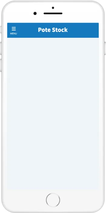
HTML・CSSのみで実装するポップアップ・モーダルウィンドウのデザイン2選
ユーザーへの通知・補足・詳細な情報の表示など様々な用途に使われるポップアップ・モーダルウィンドウ。今回はそんなモーダルをコピペだけで取り入れることができるデザインスニペットをまとめました。JavaScriptを使わずHTML・CSSのみで実装しているものなのでカスタマイズのハードルも低めです。
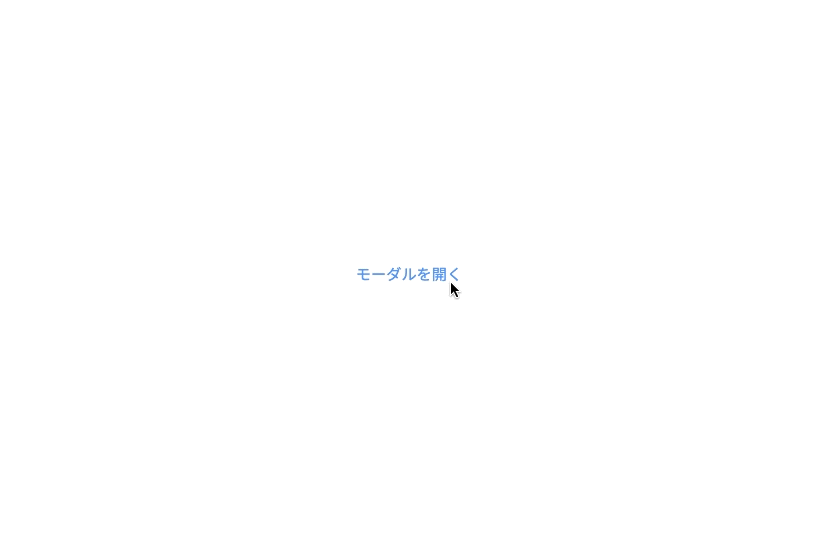
ラジオボタンで作るモーダル
リンク風
デザインを調整する
HTMLをコピペする
          <div class="modal-1__wrap">
  <input type="radio" id="modal-1__open" class="modal-1__open-input" name="modal-1__trigger"/>
  <label for="modal-1__open"  class="modal-1__open-label">モーダルを開く</label>
  <input type="radio" id="modal-1__close" name="modal-1__trigger"/>
  <div class="modal-1">
    <div class="modal-1__content-wrap">
      <label for="modal-1__close" class="modal-1__close-label">×</label>
      <div class="modal-1__content">ここにモーダルの中身が入ります。ここにモーダルの中身が入ります。<br/>ここにモーダルの中身が入ります。ここにモーダルの中身が入ります。<br/>ここにモーダルの中身が入ります。ここにモーダルの中身が入ります。</div>
    </div>
    <label for="modal-1__close">
      <div class="modal-1__background"></div>
    </label>
  </div>
</div>
CSSをコピペする
          .modal-1__wrap {
    display: inline-block;
}

.modal-1__wrap input {
    display: none;
}

.modal-1__open-label,
.modal-1__close-label {
    cursor: pointer;
}

.modal-1__open-label {
    color: #4f96f6;
    font-size: .95em;
}

.modal-1__open-label:hover {
    text-decoration: underline;
    cursor: pointer;
    color: #c7511f;
}

.modal-1 {
    position: fixed;
    left: 0;
    top: 0;
    width: 100%;
    height: 100%;
    z-index: 9999;
    display: none;
}

.modal-1__open-input:checked + label + input + .modal-1 {
    display: block;
    animation: modal-1-animation .6s;
}

.modal-1__content-wrap {
    position: absolute;
    left: 50%;
    top: 50%;
    transform: translate(-50%, -50%);
    width: 80%;
    max-width: 650px;
    background-color: #fefefe;
    z-index: 2;
    border-radius: 5px;
}

.modal-1__close-label {
    background-color: #777;
    color: #fff;
    border: 2px solid #fff;
    border-radius: 20px;
    width: 36px;
    height: 36px;
    line-height: 1.5;
    text-align: center;
    display: table-cell;
    position: fixed;
    top: -15px;
    right: -2%;
    z-index: 99999;
    font-size: 1.4em;
}

.modal-1__content {
    max-height: 50vh;
    overflow-y: auto;
    padding: 39px 45px 40px;
}

.modal-1__background {
    position: absolute;
    left: 0;
    top: 0;
    width: 100%;
    height: 100%;
    background-color: rgba(0, 0, 0, .45);
    z-index: 1;
}

@keyframes modal-1-animation {
    0% {
        opacity: 0;
    }
    100% {
        opacity: 1;
    }
}

@media only screen and (max-width: 520px) {
    .modal-1__open-label {
        max-width: 90%;
        padding: .94em 2.1em .94em 2.6em;
    }

    .modal-1__close-label {
        top: -17px;
        right: -4%;
    }

    .modal-1__content-wrap {
        width: 90vw;
    }

    .modal-1__content {
        padding: 33px 21px 35px;
        max-width: 100%;
    }
}
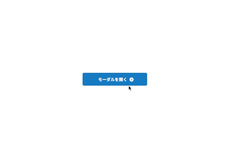
ボタン風
デザインを調整する
HTMLをコピペする
          <div class="modal-2__wrap">
    <input type="radio" id="modal-2__open" class="modal-2__open-input" name="modal-2__trigger"/>
    <label for="modal-2__open" class="modal-2__open-label">モーダルを開く</label>
    <input type="radio" id="modal-2__close" name="modal-2__trigger"/>
    <div class="modal-2">
        <div class="modal-2__content-wrap">
            <label for="modal-2__close" class="modal-2__close-label">×</label>
            <div class="modal-2__content">ここにモーダルの中身が入ります。ここにモーダルの中身が入ります。<br/>ここにモーダルの中身が入ります。ここにモーダルの中身が入ります。<br/>ここにモーダルの中身が入ります。ここにモーダルの中身が入ります。</div>
        </div>
        <label for="modal-2__close">
            <div class="modal-2__background"></div>
        </label>
    </div>
</div>
CSSをコピペする
          .modal-2__wrap input {
    display: none;
}

.modal-2__open-label,
.modal-2__close-label {
    cursor: pointer;
}

.modal-2__open-label {
    display: flex;
    justify-content: center;
    align-items: center;
    width: 250px;
    margin:0 auto;
    padding: .8em 2em;
    border: none;
    border-radius: 5px;
    background-color: #2589d0;
    color: #ffffff;
    font-weight: 600;
    font-size: 1em;
}

.modal-2__open-label:hover {
    background-color: #fff;
    color: #2589d0;
    outline: 1px solid #2589d0;
}

.modal-2 {
    position: fixed;
    left: 0;
    top: 0;
    width: 100%;
    height: 100%;
    z-index: 9999;
    display: none;
}

.modal-2__open-input:checked + label + input + .modal-2 {
    display: block;
    animation: modal-2-animation .6s;
}

.modal-2__content-wrap {
    position: absolute;
    left: 50%;
    top: 50%;
    transform: translate(-50%, -50%);
    width: 80%;
    max-width: 650px;
    background-color: #fefefe;
    z-index: 2;
    border-radius: 5px;
}

.modal-2__close-label {
    background-color: #777;
    color: #fff;
    border: 2px solid #fff;
    border-radius: 20px;
    width: 36px;
    height: 36px;
    line-height: 1.6;
    text-align: center;
    display: table-cell;
    position: fixed;
    top: -15px;
    right: -2%;
    z-index: 99999;
    font-size: 1.3em;
}

.modal-2__content {
    max-height: 50vh;
    overflow-y: auto;
    padding: 39px 45px 40px;
}

.modal-2__background {
    position: absolute;
    left: 0;
    top: 0;
    width: 100%;
    height: 100%;
    background-color: rgba(0, 0, 0, .45);
    z-index: 1;
}

@keyframes modal-2-animation {
    0% {
        opacity: 0;
    }
    100% {
        opacity: 1;
    }
}

@media only screen and (max-width: 520px) {
    .modal-2__open-label {
        max-width: 90%;
        padding: .94em 2.1em .94em 2.6em;
    }

    .modal-2__close-label {
        top: -17px;
        right: -4%;
    }

    .modal-2__content-wrap {
        width: 90vw;
    }

    .modal-2__content {
        padding: 33px 21px 35px;
        max-width: 100%;
    }
}