


HTML・CSSでつくるローディングアニメーション16選
ユーザーの離脱を防ぐことができる、スピナーやバーといった様々なローディングアニメーションをまとめました。JavaScriptを使ったオシャレなものからSVGのみで実装できるシンプルなものまで、どれもコピペで取り入れることが可能です。
ローディングスピナー
回転する長方形
デザインを調整する
HTMLをコピペする
          <svg xmlns="http://www.w3.org/2000/svg" viewBox="0 0 32 32" width="48" height="48" fill="#2589d0">
    <path d="M14 0 H18 V8 H14 z" transform="rotate(0 16 16)" opacity=".1">
        <animate attributeName="opacity" from="1" to=".1" begin="0" dur="1s" repeatCount="indefinite"/>
    </path>
    <path d="M14 0 H18 V8 H14 z" transform="rotate(45 16 16)" opacity=".1">
        <animate attributeName="opacity" from="1" to=".1" begin="0.125s" dur="1s" repeatCount="indefinite"/>
    </path>
    <path d="M14 0 H18 V8 H14 z" transform="rotate(90 16 16)" opacity=".1">
        <animate attributeName="opacity" from="1" to=".1" begin="0.25s" dur="1s" repeatCount="indefinite"/>
    </path>
    <path d="M14 0 H18 V8 H14 z" transform="rotate(135 16 16)" opacity=".1">
        <animate attributeName="opacity" from="1" to=".1" begin="0.375s" dur="1s" repeatCount="indefinite"/>
    </path>
    <path d="M14 0 H18 V8 H14 z" transform="rotate(180 16 16)" opacity=".1">
        <animate attributeName="opacity" from="1" to=".1" begin="0.5s" dur="1s" repeatCount="indefinite"/>
    </path>
    <path d="M14 0 H18 V8 H14 z" transform="rotate(225 16 16)" opacity=".1">
        <animate attributeName="opacity" from="1" to=".1" begin="0.625s" dur="1s" repeatCount="indefinite"/>
    </path>
    <path d="M14 0 H18 V8 H14 z" transform="rotate(270 16 16)" opacity=".1">
        <animate attributeName="opacity" from="1" to=".1" begin="0.75s" dur="1s" repeatCount="indefinite"/>
    </path>
    <path d="M14 0 H18 V8 H14 z" transform="rotate(315 16 16)" opacity=".1">
        <animate attributeName="opacity" from="1" to=".1" begin="0.875s" dur="1s" repeatCount="indefinite"/>
    </path>
</svg>
回転する円
デザインを調整する
HTMLをコピペする
          <svg xmlns="http://www.w3.org/2000/svg" viewBox="0 0 24 24" width="48" height="48" fill="#2589d0">
    <circle cx="12" cy="2" r="2" opacity=".1">
        <animate attributeName="opacity" from="1" to=".1" dur="1s" repeatCount="indefinite" begin="0"/>
    </circle>
    <circle transform="rotate(45 12 12)" cx="12" cy="2" r="2" opacity=".1">
        <animate attributeName="opacity" from="1" to=".1" dur="1s" repeatCount="indefinite" begin=".125s"/>
    </circle>
    <circle transform="rotate(90 12 12)" cx="12" cy="2" r="2" opacity=".1">
        <animate attributeName="opacity" from="1" to=".1" dur="1s" repeatCount="indefinite" begin=".25s"/>
    </circle>
    <circle transform="rotate(135 12 12)" cx="12" cy="2" r="2" opacity=".1">
        <animate attributeName="opacity" from="1" to=".1" dur="1s" repeatCount="indefinite" begin=".375s"/>
    </circle>
    <circle transform="rotate(180 12 12)" cx="12" cy="2" r="2" opacity=".1">
        <animate attributeName="opacity" from="1" to=".1" dur="1s" repeatCount="indefinite" begin=".5s"/>
    </circle>
    <circle transform="rotate(225 12 12)" cx="12" cy="2" r="2" opacity=".1">
        <animate attributeName="opacity" from="1" to=".1" dur="1s" repeatCount="indefinite" begin=".625s"/>
    </circle>
    <circle transform="rotate(270 12 12)" cx="12" cy="2" r="2" opacity=".1">
        <animate attributeName="opacity" from="1" to=".1" dur="1s" repeatCount="indefinite" begin=".75s"/>
    </circle>
    <circle transform="rotate(315 12 12)" cx="12" cy="2" r="2" opacity=".1">
        <animate attributeName="opacity" from="1" to=".1" dur="1s" repeatCount="indefinite" begin=".875s"/>
    </circle>
</svg>
拡大縮小しながら回転する円
デザインを調整する
HTMLをコピペする
          <svg xmlns="http://www.w3.org/2000/svg" viewBox="0 0 24 24" width="48" height="48" fill="#2589d0">
    <circle cx="12" cy="2" r="0">
        <animate attributeName="r" values="0;2;0;0" dur="1s" repeatCount="indefinite" begin="0"
                 keySplines=".2 .2 .4 .8;.2 .2 .4 .8;.2 .2 .4 .8" calcMode="spline"/>
    </circle>
    <circle transform="rotate(45 12 12)" cx="12" cy="2" r="0">
        <animate attributeName="r" values="0;2;0;0" dur="1s" repeatCount="indefinite" begin=".125s"
                 keySplines=".2 .2 .4 .8;.2 .2 .4 .8;.2 .2 .4 .8" calcMode="spline"/>
    </circle>
    <circle transform="rotate(90 12 12)" cx="12" cy="2" r="0">
        <animate attributeName="r" values="0;2;0;0" dur="1s" repeatCount="indefinite" begin=".25s"
                 keySplines=".2 .2 .4 .8;.2 .2 .4 .8;.2 .2 .4 .8" calcMode="spline"/>
    </circle>
    <circle transform="rotate(135 12 12)" cx="12" cy="2" r="0">
        <animate attributeName="r" values="0;2;0;0" dur="1s" repeatCount="indefinite" begin=".375s"
                 keySplines=".2 .2 .4 .8;.2 .2 .4 .8;.2 .2 .4 .8" calcMode="spline"/>
    </circle>
    <circle transform="rotate(180 12 12)" cx="12" cy="2" r="0">
        <animate attributeName="r" values="0;2;0;0" dur="1s" repeatCount="indefinite" begin=".5s"
                 keySplines=".2 .2 .4 .8;.2 .2 .4 .8;.2 .2 .4 .8" calcMode="spline"/>
    </circle>
    <circle transform="rotate(225 12 12)" cx="12" cy="2" r="0">
        <animate attributeName="r" values="0;2;0;0" dur="1s" repeatCount="indefinite" begin=".625s"
                 keySplines=".2 .2 .4 .8;.2 .2 .4 .8;.2 .2 .4 .8" calcMode="spline"/>
    </circle>
    <circle transform="rotate(270 12 12)" cx="12" cy="2" r="0">
        <animate attributeName="r" values="0;2;0;0" dur="1s" repeatCount="indefinite" begin=".75s"
                 keySplines=".2 .2 .4 .8;.2 .2 .4 .8;.2 .2 .4 .8" calcMode="spline"/>
    </circle>
    <circle transform="rotate(315 12 12)" cx="12" cy="2" r="0">
        <animate attributeName="r" values="0;2;0;0" dur="1s" repeatCount="indefinite" begin=".875s"
                 keySplines=".2 .2 .4 .8;.2 .2 .4 .8;.2 .2 .4 .8" calcMode="spline"/>
    </circle>
    <circle transform="rotate(180 12 12)" cx="12" cy="2" r="0">
        <animate attributeName="r" values="0;2;0;0" dur="1s" repeatCount="indefinite" begin=".5s"
                 keySplines=".2 .2 .4 .8;.2 .2 .4 .8;.2 .2 .4 .8" calcMode="spline"/>
    </circle>
</svg>

近付きながら回転する円
デザインを調整する
HTMLをコピペする
          <svg xmlns="http://www.w3.org/2000/svg" viewBox="0 0 24 24" width="48" height="48" fill="#2589d0">
    <circle cx="12" cy="3" r="3">
        <animate attributeName="cx" values="12;21;3;12" calcMode="linear" dur="2.2s" repeatCount="indefinite"/>
        <animate attributeName="cy" values="3;21;21;3" calcMode="linear" dur="2.2s" repeatCount="indefinite"/>
    </circle>
    <circle cx="21" cy="21" r="3">
        <animate attributeName="cx" values="21;3;12;21" calcMode="linear" dur="2.2s" repeatCount="indefinite"/>
        <animate attributeName="cy" values="21;21;3;21" calcMode="linear" dur="2.2s" repeatCount="indefinite"/>
    </circle>
    <circle cx="3" cy="21" r="3">
        <animate attributeName="cx" values="3;12;21;3" calcMode="linear" dur="2.2s" repeatCount="indefinite"/>
        <animate attributeName="cy" values="21;3;21;21" calcMode="linear" dur="2.2s" repeatCount="indefinite"/>
    </circle>
</svg>

なぞられる輪
デザインを調整する
HTMLをコピペする
          <svg xmlns="http://www.w3.org/2000/svg" viewBox="0 0 24 24" width="48" height="48">
    <path fill="#f2f2f2"
          d="M12,0C5.4,0,0,5.4,0,12s5.4,12,12,12,12-5.4,12-12S18.6,0,12,0m0,3c5,0,9,4,9,9s-4,9-9,9S3,17,3,12,7,3,12,3"/>
    <path fill="#2589d0" d="M12,0c6.6,0,12,5.4,12,12h-3c0-5-4-9-9-9V0Z">
        <animateTransform attributeName="transform" type="rotate" repeatCount="indefinite"
                          from="0 12 12" to="360 12 12" dur="1s"/>
    </path>
</svg>

長さを変えながら回転する輪
デザインを調整する
HTMLをコピペする
          <svg xmlns="http://www.w3.org/2000/svg" viewBox="0 0 24 24" width="48" height="48">
    <circle cx="12" cy="12" r="10" fill="none" stroke="#2589d0"
            stroke-width="2" stroke-dasharray="63" stroke-linecap="round">
        <animate attributeName="stroke-dashoffset" values="63;16;63" keyTimes="0;.5;1"
                 keySplines=".42 0 .58 1;.42 0 .58 1;" calcMode="spline"
                 dur="1.4s" repeatCount="indefinite"/>
        <animateTransform attributeName="transform" type="rotate" values="0,12,12;135,12,12;450,12,12"
                          keySplines=".42 0 .58 1;.42 0 .58 1;" calcMode="spline"
                          dur="1.4s" repeatCount="indefinite"/>
        <animateTransform attributeName="transform" type="rotate" from="0,12,12" to="270,12,12"
                          calcMode="linear" dur="1.4s" repeatCount="indefinite" additive="sum"/>
    </circle>
</svg>

時計風
デザインを調整する
HTMLをコピペする
          <svg xmlns="http://www.w3.org/2000/svg" viewBox="0 0 24 24" width="48" height="48" fill="#2589d0">
    <circle cx="12" cy="12" r="11" fill="none" stroke="#2589d0"/>
    <rect x="11.5" y="3" width="1" height="9">
        <animateTransform attributeName="transform" type="rotate"
                          from="0,12,12" to="360,12,12"
                          dur="2s" calcMode="linear" repeatCount="indefinite"/>
    </rect>
    <rect x="11.5" y="6" width="1" height="6.5">
        <animateTransform attributeName="transform" type="rotate"
                          from="0,12,12" to="360,12,12"
                          dur="8s" calcMode="linear" repeatCount="indefinite"/>
    </rect>
</svg>

円の中で回転する円
デザインを調整する
HTMLをコピペする
          <svg xmlns="http://www.w3.org/2000/svg" viewBox="0 0 24 24" width="48" height="48">
    <circle cx="12" cy="12" r="12" fill="#2589d0"/>
    <circle cx="12" cy="5" r="4" fill="#fff">
        <animateTransform attributeName="transform" type="rotate"
                          from="0 12 12" to="360 12 12" dur="1s" repeatCount="indefinite"/>
    </circle>
</svg>

バウンドする円
デザインを調整する
HTMLをコピペする
          <svg xmlns="http://www.w3.org/2000/svg" viewBox="0 0 24 24" width="48" height="48" fill="#2589d0">
    <circle cx="12" cy="12" r="12" opacity=".5">
        <animate attributeName="r" values="0;12;0" keySplines="0.42 0.0 0.58 1.0"
                 dur="2s" repeatCount="indefinite" begin="0"/>
    </circle>
    <circle cx="12" cy="12" r="0" opacity=".5">
        <animate attributeName="r" values="0;12;0" keySplines="0.42 0.0 0.58 1.0"
                 dur="2s" repeatCount="indefinite" begin="1s"/>
    </circle>
</svg>

波紋を出す円
デザインを調整する
HTMLをコピペする
          <svg xmlns="http://www.w3.org/2000/svg" viewBox="0 0 24 24" width="48" height="48" fill="#2589d0">
    <circle cx="12" cy="12" r="0">
        <animate attributeName="opacity" values="0;1;0"
                 keyTimes="0;.05;1" calcMode="linear"
                 dur="1s" repeatCount="indefinite"/>
        <animate attributeName="r" from="0" to="12"
                 dur="1s" repeatCount="indefinite"/>
    </circle>
    <circle cx="12" cy="12" r="0">
        <animate attributeName="opacity" values="0;1;0"
                 keyTimes="0;.05;1" calcMode="linear"
                 dur="1s" begin=".3s" repeatCount="indefinite"/>
        <animate attributeName="r" from="0" to="12"
                 dur="1s" begin=".3s" repeatCount="indefinite"/>
    </circle>
    <circle cx="12" cy="12" r="0">
        <animate attributeName="opacity" values="0;1;0"
                 keyTimes="0;.05;1" calcMode="linear"
                 dur="1s" begin=".6s" repeatCount="indefinite"/>
        <animate attributeName="r" from="0" to="12"
                 dur="1s" begin=".6s" repeatCount="indefinite"/>
    </circle>
</svg>

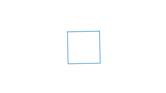
回転する正方形
デザインを調整する
HTMLをコピペする
          <svg xmlns="http://www.w3.org/2000/svg" viewBox="0 0 48 48" width="48" height="48" fill="#f2f2f2">
        <rect x="0" y="0" width="14" height="14" fill="#e6edf3">
            <animate attributeName="fill" values="#2589d0;#f2f2f2;#f2f2f2" keyTimes="0;0.125;1" dur="1s"
                     repeatCount="indefinite" begin="0s" calcMode="discrete"></animate>
        </rect>
        <rect x="17" y="0" width="14" height="14" fill="#e6edf3">
            <animate attributeName="fill" values="#2589d0;#f2f2f2;#f2f2f2" keyTimes="0;0.125;1" dur="1s"
                     repeatCount="indefinite" begin="0.125s" calcMode="discrete"></animate>
        </rect>
        <rect x="34" y="0" width="14" height="14" fill="#e6edf3">
            <animate attributeName="fill" values="#2589d0;#f2f2f2;#f2f2f2" keyTimes="0;0.125;1" dur="1s"
                     repeatCount="indefinite" begin="0.25s" calcMode="discrete"></animate>
        </rect>
        <rect x="0" y="17" width="14" height="14" fill="#e6edf3">
            <animate attributeName="fill" values="#2589d0;#f2f2f2;#f2f2f2" keyTimes="0;0.125;1" dur="1s"
                     repeatCount="indefinite" begin="0.875s" calcMode="discrete"></animate>
        </rect>
        <rect x="34" y="17" width="14" height="14" fill="#e6edf3">
            <animate attributeName="fill" values="#2589d0;#f2f2f2;#f2f2f2" keyTimes="0;0.125;1" dur="1s"
                     repeatCount="indefinite" begin="0.375s" calcMode="discrete"></animate>
        </rect>
        <rect x="0" y="34" width="14" height="14" fill="#e6edf3">
            <animate attributeName="fill" values="#2589d0;#f2f2f2;#f2f2f2" keyTimes="0;0.125;1" dur="1s"
                     repeatCount="indefinite" begin="0.75s" calcMode="discrete"></animate>
        </rect>
        <rect x="17" y="34" width="14" height="14" fill="#e6edf3">
            <animate attributeName="fill" values="#2589d0;#f2f2f2;#f2f2f2" keyTimes="0;0.125;1" dur="1s"
                     repeatCount="indefinite" begin="0.625s" calcMode="discrete"></animate>
        </rect>
        <rect x="34" y="34" width="14" height="14" fill="#e6edf3">
            <animate attributeName="fill" values="#2589d0;#f2f2f2;#f2f2f2" keyTimes="0;0.125;1" dur="1s"
                     repeatCount="indefinite" begin="0.5s" calcMode="discrete"></animate>
        </rect>
    </svg>
回転する立方体
デザインを調整する
HTMLをコピペする
          <div class="loading-15">
    <span></span>
    <span></span>
    <span></span>
    <span></span>
    <span></span>
    <span></span>
</div>
CSSをコピペする
          .loading-15 {
    transform-style: preserve-3d;
    animation: animation-loading-15 3s infinite forwards;
}

.loading-15 span {
    position: absolute;
    top: -24px;
    left: -24px;
    width: 48px;
    height: 48px;
    border: 1px solid #2589d0;
    background-color: #fff;
}

.loading-15 span:nth-of-type(1) {
    transform: translateZ(24px);
}

.loading-15 span:nth-of-type(2) {
    transform: rotateY(180deg) translateZ(24px);
}

.loading-15 span:nth-of-type(3) {
    transform: rotateY(-90deg) translateZ(24px);
}

.loading-15 span:nth-of-type(4) {
    transform: rotateY(90deg) translateZ(24px);
}

.loading-15 span:nth-of-type(5) {
    transform: rotateX(-90deg) translateZ(24px)
}

.loading-15 span:nth-of-type(6) {
    transform: rotateX(90deg) translateZ(24px);
}

@keyframes animation-loading-15 {
    0% {
        transform: rotateY(0deg) rotateZ(0deg);
    }
    20% {
        transform: rotateY(90deg) rotateZ(0deg);
    }
    40% {
        transform: rotateX(45deg) rotateZ(45deg);
    }
    60% {
        transform: rotateX(90deg) rotateY(180deg) rotateX(90deg);
    }
    80% {
        transform: rotateX(310deg) rotateZ(230deg)
    }
    100% {
        transform: rotateX(360deg) rotateZ(360deg)
    }
}
ローディングバー

2つの周期で動くバー
デザインを調整する
HTMLをコピペする
          <svg xmlns="http://www.w3.org/2000/svg" viewBox="0 0 150 5" width="150" height="5">
    <rect x="0" y="0" rx="2" ry="2" width="150" height="5" fill="#f2f2f2"/>
    <rect x="0" y="0" rx="2" ry="2" width="150" height="5" fill="#2589d0" transform="scale(0,1)">
        <animateTransform attributeName="transform" type="translate"
                          values="-75,0;-20,0;50,0;250,0"
                          keyTimes="0;.3;.5;1"
                          keySplines="0 0 1 1;.3 .3 .8 .7;.4 .6 .6 .9"
                          dur="2s" repeatCount="indefinite" calcMode="spline"/>
        <animateTransform attributeName="transform" type="scale"
                          values=".1,1;.5,1;.7,1;.1,1"
                          keyTimes="0;.4;.8;1"
                          keySplines="0 0 1 1;.3 .1 .8 1;.1 .1 .6 1"
                          dur="2s" repeatCount="indefinite" calcMode="spline" additive="sum"/>
    </rect>
    <rect x="0" y="0" rx="2" ry="2" width="150" height="5" fill="#2589d0" transform="scale(0,1)">
        <animateTransform attributeName="transform" type="translate"
                          values="-50,0;-50,0;-50,0;165,0"
                          keyTimes="0;.2;.6;1"
                          keySplines="0 0 1 1;.5 0 .7 .5;.3 .4 .6 1"
                          dur="2s" repeatCount="indefinite" calcMode="spline" begin=".5s"/>
        <animateTransform attributeName="transform" type="scale"
                          values=".1,1;.1,1;.7,1;.1,1"
                          keyTimes="0;.4;.7;1"
                          keySplines="0 0 1 1;.3 .1 .8 1;.1 .1 .6 1"
                          dur="2s" repeatCount="indefinite" calcMode="spline" additive="sum" begin=".5s"/>
    </rect>
</svg>

縦に伸びる棒 (5本)
デザインを調整する
HTMLをコピペする
          <svg xmlns="http://www.w3.org/2000/svg" viewBox="0 0 32 32" width="72" height="72" fill="#2589d0">
    <path transform="translate(2)" d="M0 12 V20 H4 V12z">
        <animate attributeName="d" values="M0 12 V20 H4 V12z; M0 4 V28 H4 V4z; M0 12 V20 H4 V12z; M0 12 V20 H4 V12z"
                 dur="1.2s" calcMode="spline" begin="0" repeatCount="indefinite"
                 keytimes="0;.2;.5;1" keySplines=".2 .2 .4 .8;.2 0.6 .4 .8;.2 .8 .4 .8"/>
    </path>
    <path transform="translate(8)" d="M0 12 V20 H4 V12z">
        <animate attributeName="d" values="M0 12 V20 H4 V12z; M0 4 V28 H4 V4z; M0 12 V20 H4 V12z; M0 12 V20 H4 V12z"
                 dur="1.2s" calcMode="spline" begin=".2" repeatCount="indefinite"
                 keytimes="0;.2;.5;1" keySplines=".2 .2 .4 .8;.2 0.6 .4 .8;.2 .8 .4 .8"/>
    </path>
    <path transform="translate(14)" d="M0 12 V20 H4 V12z">
        <animate attributeName="d" values="M0 12 V20 H4 V12z; M0 4 V28 H4 V4z; M0 12 V20 H4 V12z; M0 12 V20 H4 V12z"
                 dur="1.2s" calcMode="spline" begin=".4" repeatCount="indefinite"
                 keytimes="0;.2;.5;1" keySplines=".2 .2 .4 .8;.2 0.6 .4 .8;.2 .8 .4 .8"/>
    </path>
    <path transform="translate(20)" d="M0 12 V20 H4 V12z">
        <animate attributeName="d" values="M0 12 V20 H4 V12z; M0 4 V28 H4 V4z; M0 12 V20 H4 V12z; M0 12 V20 H4 V12z"
                 dur="1.2s" calcMode="spline" begin=".6" repeatCount="indefinite"
                 keytimes="0;.2;.5;1" keySplines=".2 .2 .4 .8;.2 0.6 .4 .8;.2 .8 .4 .8"/>
    </path>
    <path transform="translate(26)" d="M0 12 V20 H4 V12z">
        <animate attributeName="d" values="M0 12 V20 H4 V12z; M0 4 V28 H4 V4z; M0 12 V20 H4 V12z; M0 12 V20 H4 V12z"
                 dur="1.2s" calcMode="spline" begin=".8" repeatCount="indefinite"
                 keytimes="0;.2;.5;1" keySplines=".2 .2 .4 .8;.2 0.6 .4 .8;.2 .8 .4 .8"/>
    </path>
</svg>
ローディングテキスト

波状的に上下する文字
デザインを調整する
HTMLをコピペする
          <div class="loading-5">
    <p>
        <span>L</span>
        <span>o</span>
        <span>a</span>
        <span>d</span>
        <span>i</span>
        <span>n</span>
        <span>g</span>
        <span>.</span>
        <span>.</span>
        <span>.</span>
    </p>
</div>
CSSをコピペする
          .loading-5 {
    display: flex;
    justify-content: center;
    align-items: center;
}

.loading-5 span {
    display: inline-block;
    color: #2589d0;
    font-weight: 600;
    font-size: 1.5em;
    animation: animation-loading-5 1s infinite;
}

.loading-5 span:nth-of-type(2) {
    animation-delay: .1s;
}

.loading-5 span:nth-of-type(3) {
    animation-delay: .2s;
}

.loading-5 span:nth-of-type(4) {
    animation-delay: .3s;
}

.loading-5 span:nth-of-type(5) {
    animation-delay: .4s;
}

.loading-5 span:nth-of-type(6) {
    animation-delay: .5s;
}

.loading-5 span:nth-of-type(7) {
    animation-delay: .6s;
}

.loading-5 span:nth-of-type(8) {
    animation-delay: .7s;
}

.loading-5 span:nth-of-type(9) {
    animation-delay: .8s;
}

.loading-5 span:nth-of-type(10) {
    animation-delay: .9s;
}

@keyframes animation-loading-5 {
    50% {
        transform: translateY(10px);
    }
}
その他のローディング

記事の読み込み
デザインを調整する
記事一覧などでコンテンツを読み込む際に使えるローティングアニメーションです。幅や行数は使用箇所に応じて適宜調整してみてください。
HTMLをコピペする
          <div class="loading-16">
    <div></div>
    <div></div>
    <div></div>
</div>
<div class="loading-16">
    <div></div>
    <div></div>
    <div></div>
</div>
CSSをコピペする
          .loading-16 {
    display: flex;
    flex-direction: column;
    gap: 8px;
    position: relative;
    margin-bottom: 1em;
}

.loading-16::before {
    position: absolute;
    width: 34px;
    height: 34px;
    border-radius: 3px;
    background-color: #eeeeee;
    content: '';
}

.loading-16 div {
    width: 300px;
    height: 13px;
    margin-left: 43px;
    border-radius: 3px;
    background-color: #eeeeee;
    background-image: linear-gradient(to right, #eeeeee 5%, #dedede 15%, #eeeeee 30%);
    animation: anim-loading-16 2s linear infinite;
}

@keyframes anim-loading-16 {
    from {
        background-position-x: -300px;
    }
    to {
        background-position-x: 300px;
    }
}