


HTML・CSSでつくるおしゃれな見出しのデザイン39選
ブログ・メディアなど形式問わず使われるh (見出し) タグ。見出しタグのデザイン一つでコンテンツの見やすさがガラッと変わる、と言っても過言ではないほど重要な要素です。今回はそんな見出しのデザインスニペットをまとめました。ぜひご自身のサイトに活用してみてください。
シンプルな見出し
左線
デザインを調整する
HTMLをコピペする
<h2 class="heading-1">CSS見出しデザイン</h2>
CSSをコピペする
          .heading-1 {
    padding: .5em .7em;
    border-left: 5px solid #2589d0;
    color: #333333;
}
左線 & 背景色
デザインを調整する
HTMLをコピペする
<h2 class="heading-22">CSS見出しデザイン</h2>
CSSをコピペする
          .heading-22 {
    padding: .5em .7em;
    border-left: 5px solid #2589d0;
    background-color: #f2f2f2;
    color: #333333;
}
左線 & 背景色 (立体的)
デザインを調整する
HTMLをコピペする
<h2 class="heading-23">CSS見出しデザイン</h2>
CSSをコピペする
          .heading-23 {
    padding: .5em .7em;
    border-left: 5px solid #2589d0;
    border-bottom: 3px solid #d2d2d2;
    background-color: #f2f2f2;
    color: #333333;
}

左線 & 背景色 (内側)
デザインを調整する
HTMLをコピペする
<h2 class="heading-41">CSS見出しデザイン</h2>
CSSをコピペする
          .heading-41 {
    display: flex;
    align-items: center;
    padding: .5em .7em;
    background-color: #f2f2f2;
    color: #333333;
}

.heading-41::before {
    display: inline-block;
    width: 5px;
    height: 1.5em;
    margin-right: .5em;
    background-color: #2589d0;
    content: '';
}

下線
デザインを調整する
HTMLをコピペする
<h2 class="heading-2">CSS見出しデザイン</h2>
CSSをコピペする
          .heading-2 {
    padding:0 .4em .2em;
    border-bottom: 3px solid #2589d0;
    background-color: #ffffff;
    color: #333333;
}

文字数に応じて長さが変わる下線
デザインを調整する
HTMLをコピペする
          <h2 class="heading-33">
    <span>CSS見出しデザイン</span>
</h2>
CSSをコピペする
          .heading-33 {
    border-bottom: 3px solid #f2f2f2;
}

.heading-33 span {
    display: inline-block;
    position: relative;
    padding: 0 .4em .2em;
    color: #333333;
}

.heading-33 span::before {
    position: absolute;
    bottom: -3px;
    left: 0;
    width: 100%;
    height: 3px;
    background-color: #2589d0;
    content: '';
}

下線 (点線)
デザインを調整する
HTMLをコピペする
<h2 class="heading-3">CSS見出しデザイン</h2>
CSSをコピペする
          .heading-3 {
    padding:0 .4em .2em;
    border-bottom: 3px dotted #2589d0;
    background-color: #ffffff;
    color: #333333;
}

下線 (破線)
デザインを調整する
HTMLをコピペする
<h2 class="heading-4">CSS見出しデザイン</h2>
CSSをコピペする
          .heading-4 {
    padding:0 .4em .2em;
    border-bottom: 3px dashed #2589d0;
    background-color: #ffffff;
    color: #333333;
}

下線 (二重線)
デザインを調整する
HTMLをコピペする
<h2 class="heading-5">CSS見出しデザイン</h2>
CSSをコピペする
          .heading-5 {
    padding:0 .4em .2em;
    border-bottom: 3px double #2589d0;
    background-color: #ffffff;
    color: #333333;
}

吹き出し風 (下線のみ)
デザインを調整する
HTMLをコピペする
<h2 class="heading-21">CSS見出しデザイン</h2>
CSSをコピペする
          .heading-21 {
    position: relative;
    padding: .5em .7em .4em;
    border-bottom: 3px solid #2589d0;
    color: #333333;
}

.heading-21::before,
.heading-21::after {
    position: absolute;
    left: 30px;
    bottom: -15px;
    width: 30px;
    height: 15px;
    clip-path: polygon(0 0, 100% 0, 50% 100%);
    content: '';
}

.heading-21::before {
    background-color: #2589d0;
}

.heading-21::after {
    bottom: -11px;
    background-color: #fff;
}

四角形の装飾
デザインを調整する
HTMLをコピペする
<h2 class="heading-31">CSS見出しデザイン</h2>
CSSをコピペする
          .heading-31 {
    position: relative;
    padding: .3em 0 .2em 1em;
    border-bottom: 3px solid #2589d0;
    color: #333333;
}

.heading-31::before {
    position: absolute;
    top: 0;
    left: .3em;
    transform: rotate(55deg);
    height: 11px;
    width: 12px;
    background: #2589d0;
    content: '';
}

.heading-31::after {
    position: absolute;
    transform: rotate(15deg);
    top: .6em;
    left: 0;
    height: 8px;
    width: 8px;
    background: #2589d0;
    content: '';
}

両端に線
デザインを調整する
HTMLをコピペする
<h2 class="heading-6">CSS見出しデザイン</h2>
CSSをコピペする
          .heading-6 {
    display: inline-block;
    position: relative;
    padding: 0 2.5em;
    color: #333333;
}

.heading-6::before,
.heading-6::after {
    content: '';
    display: inline-block;
    position: absolute;
    top: 50%;
    width: 45px;
    height: 3px;
    background-color: #2589d0;
}

.heading-6::before {
    left: 0;
}

.heading-6::after {
    right: 0;
}

下線 (小)
デザインを調整する
HTMLをコピペする
<h2 class="heading-7">CSS見出しデザイン</h2>
CSSをコピペする
          .heading-7 {
    display: inline-block;
    position: relative;
    color: #333;
}

.heading-7:before {
    content: '';
    display: inline-block;
    position: absolute;
    bottom: -15px;
    left: 50%;
    transform: translateX(-50%);
    width: 60px;
    height: 4px;
    background-color: #2589d0;
}

左右に斜線
デザインを調整する
HTMLをコピペする
<h2 class="heading-16">CSS見出しデザイン</h2>
CSSをコピペする
          .heading-16 {
    display: flex;
    justify-content: center;
    align-items: center;
    color: #333333;
}

.heading-16::before,
.heading-16::after {
    width: 3px;
    height: 40px;
    background-color: #2589d0;
    content: '';
}

.heading-16::before {
    transform: rotate(-35deg);
    margin-right: 30px;
}

.heading-16::after {
    transform: rotate(35deg);
    margin-left: 30px;
}

鉤括弧
デザインを調整する
HTMLをコピペする
<h2 class="heading-36">CSS見出しデザイン</h2>
CSSをコピペする
          .heading-36 {
    position: relative;
    padding: .7em 1.3em;
    color: #333333;
}

.heading-36::before,
.heading-36::after {
    display: inline-block;
    position: absolute;
    width: 1em;
    height: 1em;
    content: '';
}

.heading-36::before {
    top: 0;
    left: 0;
    border-top: 3px solid #2589d0;
    border-left: 3px solid #2589d0;
}

.heading-36::after {
    bottom: 0;
    right: 0;
    border-bottom: 3px solid #2589d0;
    border-right: 3px solid #2589d0;
}

鉤括弧 (大)
デザインを調整する
HTMLをコピペする
<h2 class="heading-37">CSS見出しデザイン</h2>
CSSをコピペする
          .heading-37 {
    position: relative;
    padding: .5em 1em;
    color: #333333;
}

.heading-37::before,
.heading-37::after {
    display: inline-block;
    position: absolute;
    width: 10px;
    height: 100%;
    border: 3px solid #2589d0;
    box-sizing: border-box;
    content: '';
}

.heading-37::before {
    top: 0;
    left: 0;
    border-right: none;
}

.heading-37::after {
    bottom: 0;
    right: 0;
    border-left: none;
}
カラフルな見出し

タグ風
デザインを調整する
HTMLをコピペする
<h2 class="heading-8">CSS見出しデザイン</h2>
CSSをコピペする
          .heading-8 {
    display: inline-block;
    position: relative;
    padding: .5em .7em;
    border-radius: 50px 0 0 50px;
    background-color: #2589d0;
    color: #fff;
}

.heading-8::before {
    content: '';
    display: inline-block;
    width: 15px;
    height: 15px;
    margin-right: 13px;
    border-radius: 50%;
    background: #fff;
}

吹き出し風
デザインを調整する
HTMLをコピペする
<h2 class="heading-9">CSS見出しデザイン</h2>
CSSをコピペする
          .heading-9 {
    position: relative;
    padding: .5em .7em;
    border-radius: 10px;
    background-color: #2589d0;
    color: #fff;
}

.heading-9::after {
    content: '';
    position: absolute;
    top: 100%;
    left: 30px;
    width: 0;
    height: 0;
    border: 11px solid transparent;
    border-top: 11px solid #2589d0;
}

背景に回り込むリボン風
デザインを調整する
HTMLをコピペする
<h2 class="heading-11">CSS見出しデザイン</h2>
CSSをコピペする
          .heading-11 {
    position: relative;
    padding: .5em .7em;
    background-color: #2589d0;
    color: #fff;
}

.heading-11::before {
    position: absolute;
    top: 100%;
    left: 0;
    border-bottom: solid 10px transparent;
    border-right: solid 20px #1579c0;
    content: '';
}

リボン風
デザインを調整する
HTMLをコピペする
          <h2 class="heading-12">
    <span>CSS見出しデザイン</span>
</h2>
CSSをコピペする
          .heading-12 {
    position: relative;
    width: 290px;
    margin: 0 auto;
    padding: .5em .7em;
    background-color: #2589d0;
    color: #fff;
    text-align: center;
}

.heading-12::before,
.heading-12::after {
    position: absolute;
    bottom: -10px;
    z-index: -1;
    border-style: solid;
    border-color: #1579c0;
    content: '';
}

.heading-12::before {
    left: -30px;
    border-width: 25px 25px 25px 15px;
    border-left-color: transparent;
}

.heading-12::after {
    right: -30px;
    border-width: 25px 15px 25px 25px;
    border-right-color: transparent;
}

.heading-12 span::before,
.heading-12 span::after {
    position: absolute;
    bottom: -10px;
    width: 10px;
    height: 10px;
    background-color: #002970;
    content: '';
}

.heading-12 span::before {
    left: 0;
    clip-path: polygon(0 0, 100% 0%, 100% 100%);
}

.heading-12 span::after {
    right: 0;
    clip-path: polygon(0 0, 100% 0%, 0% 100%);
}

旗風
デザインを調整する
HTMLをコピペする
          <h2 class="heading-34">
    <span>CSS見出しデザイン</span>
</h2>
CSSをコピペする
          .heading-34 {
    position: relative;
    margin: 0 0 25px 9px;
    padding: .5em .8em;
    background-color: #2589d0;
    color: #fff;
}

.heading-34::before {
    position: absolute;
    top: 0;
    left: -9px;
    z-index: 1;
    width: 5px;
    height: 135%;
    border-radius: 3px;
    background-color: #600;
    content: '';
}

.heading-34 span::before,
.heading-34 span::after {
    position: absolute;
    left: -9px;
    width: 20px;
    height: 3px;
    border-radius: 3px;
    background-color: #c99;
    content: '';
}

.heading-34 span::before {
    top: 44%;
    transform: rotate(-25deg);
}

.heading-34 span::after {
    top: 54%;
    transform: rotate(25deg);
}
可愛い見出し
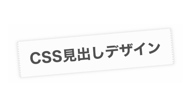
テープ風
デザインを調整する
HTMLをコピペする
<h2 class="heading-10">CSS見出しデザイン</h2>
CSSをコピペする
          .heading-10 {
    display: inline-block;
    position: relative;
    transform: rotate(-5deg);
    padding: .5em .7em;
    border-left: 2px dotted rgba(0, 0, 0, .1);
    border-right: 2px dotted rgba(0, 0, 0, .1);
    box-shadow: 0 0 5px rgba(0, 0, 0, .2);
    background-color: rgba(0, 0, 0, .01);
    color: #333333;
}
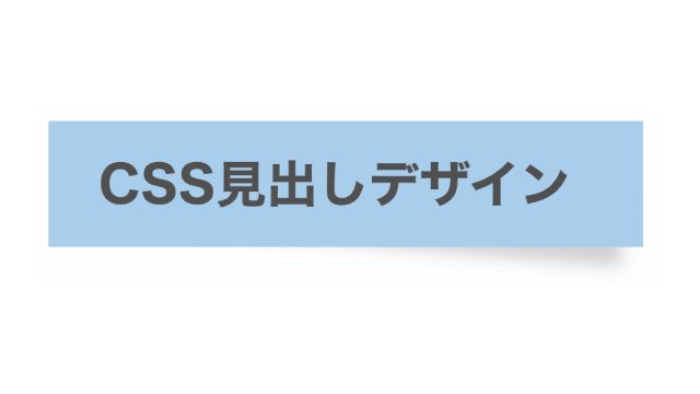
付箋風 (単色)
デザインを調整する
HTMLをコピペする
<h2 class="heading-14">CSS見出しデザイン</h2>
CSSをコピペする
          .heading-14 {
    display: inline-block;
    position: relative;
    padding: .5em 1.4em .5em 1em;
    background-color: #a9ceec;
    color: #333333;
}

.heading-14::before {
    position: absolute;
    bottom: -1px;
    right: 9px;
    z-index: -1;
    transform: rotate(5deg);
    width: 70%;
    height: 50%;
    background-color: #d0d0d0;
    content: "";
    filter: blur(4px);
}
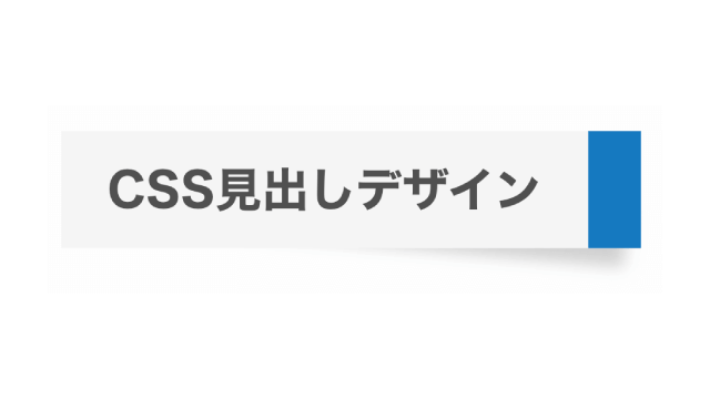
付箋風 (先端色)
デザインを調整する
HTMLをコピペする
<h2 class="heading-15">CSS見出しデザイン</h2>
CSSをコピペする
          .heading-15 {
    display: inline-block;
    position: relative;
    padding: .5em 1em;
    border-right: 27px solid #2589d0;
    background-color: #f5f5f5;
    color: #333333;
}

.heading-15::before {
    position: absolute;
    bottom: 2px;
    right: -20px;
    z-index: -1;
    transform: rotate(5deg);
    width: 100%;
    height: 50%;
    background-color: #d0d0d0;
    content: "";
    filter: blur(4px);
}

番号
デザインを調整する
HTMLをコピペする
          <h2 class="heading-17">
    <span>01</span>
    CSS見出しデザイン
</h2>
CSSをコピペする
          .heading-17 {
    display: flex;
    justify-content: start;
    align-items: center;
    position: relative;
    padding: .5em .7em;
    overflow: hidden;
    border: 2px solid #2589d0;
    border-radius: 5px;
    color: #333333;
}

.heading-17:before {
    position: absolute;
    top: -50%;
    left: -30px;
    z-index: -1;
    transform: rotate(25deg);
    width: 100px;
    height: 200%;
    background-color: #2589d0;
    content: '';
}

.heading-17 span {
    margin-right: 1.1em;
    color: #fff;
    font-size: 1.1em
}

カラフルなシャドウ
デザインを調整する
HTMLをコピペする
<h2 class="heading-18">CSS見出しデザイン</h2>
CSSをコピペする
          .heading-18 {
    padding: .5em .7em;
    border: 2px solid #2589d0;
    box-shadow: 5px 5px #2589d0;
    color: #2589d0;
}

立体的
デザインを調整する
HTMLをコピペする
<h2 class="heading-19">CSS見出しデザイン</h2>
CSSをコピペする
          .heading-19 {
    position: relative;
    padding: .5em .7em;
    border: 3px solid #333333;
    color: #333333;
}

.heading-19::before,
.heading-19::after {
    position: absolute;
    border: solid #333333;
    content: '';
}

.heading-19::before {
    top: 3px;
    right: -16px;
    transform: skewY(45deg);
    width: 10px;
    height: 100%;
    border-width: 4px 3px 3px 0;
}

.heading-19::after {
    bottom: -16px;
    left: 4px;
    transform: skewX(45deg);
    width: 100%;
    height: 10px;
    border-width: 0 2px 3px 4px;
}

ストライプ背景
デザインを調整する
HTMLをコピペする
<h2 class="heading-20">CSS見出しデザイン</h2>
CSSをコピペする
          .heading-20 {
    padding: .5em .7em;
    background-image: repeating-linear-gradient(-45deg, #bbdbfb, #bbdbfb 3px, #f2f6fc 3px, #f2f6fc 7px);
    color: #333333;
}

チェック柄
デザインを調整する
チェック柄を背景にした見出し。文字色を黒系統の色にするとせっかくの可愛らしいチェック柄が活かされないため、文字色はあえて基調色と同じものにしています。
HTMLをコピペする
<h2 class="heading-40">CSS見出しデザイン</h2>
CSSをコピペする
          .heading-40 {
    padding: .5em .7em;
    border-top: 2px solid #5ba9f7;
    border-bottom: 2px solid #5ba9f7;
    background-image: linear-gradient(45deg, #5ba9f712 25%, transparent 25%, transparent 50%, #5ba9f712 50%, #5ba9f712 75%, transparent 75%, transparent), linear-gradient(-45deg, #5ba9f712 25%, transparent 25%, transparent 50%, #5ba9f712 50%, #5ba9f712 75%, transparent 75%, transparent);
    background-color: #5ba9f70d;
    background-size: 20px 20px;
    color: #5ba9f7;
}

映画フィルム風
デザインを調整する
HTMLをコピペする
<h2 class="heading-32">CSS見出しデザイン</h2>
CSSをコピペする
          .heading-32 {
    display: flex;
    align-items: center;
    position: relative;
    padding: 1.1em 1.4em 1.1em 1em;
    background-color: #000000;
    color: #fff;
}

.heading-32::before {
    position: absolute;
    left: 5px;
    width: calc(100% - 10px);
    height: 65%;
    border-top: 10px dashed #fff;
    border-bottom: 10px dashed #fff;
    content: '';
}
おしゃれな見出し

大きいラベル
デザインを調整する
HTMLをコピペする
<h2 class="heading-28" data-label="CSS HEADING">CSS見出しデザイン</h2>
CSSをコピペする
          .heading-28 {
    color: #333333;
    font-weight: 400;
    font-size: .75rem;
    letter-spacing: .04em;
    text-align: center;
}

.heading-28::before {
    display: block;
    font-weight: 700;
    font-size: 1.65rem;
    line-height: 1.5;
    letter-spacing: .02em;
    content: attr(data-label);
}

下に反射する文字
デザインを調整する
HTMLをコピペする
<h2 class="heading-13">CSS見出しデザイン</h2>
CSSをコピペする
          .heading-13 {
    position: relative;
    color: #333333;
    -webkit-box-reflect: below -10px -webkit-linear-gradient(top, rgba(0, 0, 0, 0), rgba(0, 0, 0, 0) 10%, rgba(0, 0, 0, .5));
}

1文字目だけ大きめ
デザインを調整する
HTMLをコピペする
<h2 class="heading-26">CSS見出しデザイン</h2>
CSSをコピペする
          .heading-26 {
    color: #333333;
}

.heading-26:first-letter {
    color: #2589d0;
    font-size: 2em;
}

数字の背景
デザインを調整する
HTMLをコピペする
<h2 class="heading-24" data-number="01">CSS見出しデザイン</h2>
CSSをコピペする
          .heading-24 {
    position: relative;
    padding-top: 1.5em;
    color: #333333;
}

.heading-24::before {
    position: absolute;
    bottom: 0;
    left: 0;
    z-index: -1;
    color: #d9f4ff;
    font-size: 3em;
    line-height: 1;
    content: attr(data-number);
    pointer-events: none;
}

文字の背景
デザインを調整する
HTMLをコピペする
<h2 class="heading-25" data-word="HEADING">CSS見出しデザイン</h2>
CSSをコピペする
          .heading-25 {
    position: relative;
    padding-top: .75em;
    color: #333333;
}

.heading-25::before {
    position: absolute;
    bottom: .5em;
    left: 0;
    z-index: -1;
    color: #d9f4ff;
    font-size: 1.5em;
    line-height: 1;
    content: attr(data-word);
    pointer-events: none;
}

円の背景
デザインを調整する
HTMLをコピペする
<h2 class="heading-29">CSS見出しデザイン</h2>
CSSをコピペする
          .heading-29 {
    display: inline-block;
    position: relative;
    margin: calc(3.5em / 2) 0 calc(3.5em / 4) calc(3.5em / 2);
    color: #333333;
    line-height: 1;
}

.heading-29::before {
    position: absolute;
    bottom: calc(-3.5em / 4);
    left: calc(-3.5em / 2);
    z-index: -1;
    width: 3.5em;
    height: 3.5em;
    border-radius: 50%;
    background: #bbdbfb;
    content: '';
}
アイコン付きの見出し

重なる2つの正方形
デザインを調整する
HTMLをコピペする
<h2 class="heading-38">CSS見出しデザイン</h2>
CSSをコピペする
          .heading-38 {
    position: relative;
    padding: .5em 1.2em;
    color: #333333;
}

.heading-38::before,
.heading-38::after {
    display: inline-block;
    position: absolute;
    transform: translateY(-50%);
    width: 12px;
    height: 12px;
    border: 2px solid #2589d0;
    content: '';
}

.heading-38::before {
    top: calc(50% - 3px);
    left: 0;
}

.heading-38::after {
    top: calc(50% + 3px);
    left: 5px;
}

チェックアイコン
デザインを調整する
HTMLをコピペする
<h2 class="heading-27">CSS見出しデザイン</h2>
CSSをコピペする
          .heading-27 {
    display: flex;
    align-items: center;
    column-gap: 8px;
    color: #333333;
}

.heading-27::before {
    width: 0.8em;
    height: 0.4em;
    border-bottom: 4px solid #2589d0;
    border-left: 4px solid #2589d0;
    transform: rotate(-45deg) translate(2px, -2px);
    content: '';
}

冠アイコン
デザインを調整する
ランキングコンテンツなどで役立つ、冠のアイコンが付いた見出しです。2位は銀色、3位は銅色にするのも良いかもしれませんね。
HTMLをコピペする
<h2 class="heading-35">CSS見出しデザイン</h2>
CSSをコピペする
          .heading-35 {
    display: flex;
    align-items: center;
    gap: 0 7px;
    color: #333333;
}

.heading-35::before {
    width: 1.25em;
    height: 1.25em;
    background-image: url("data:image/svg+xml,%3Csvg xmlns='http://www.w3.org/2000/svg' viewBox='0 0 24 24'%3E%3Cpath d='M2.00488 19H22.0049V21H2.00488V19ZM2.00488 5L7.00488 8L12.0049 2L17.0049 8L22.0049 5V17H2.00488V5Z' fill='%23ffb500'%3E%3C/path%3E%3C/svg%3E");
    content: '';
}