
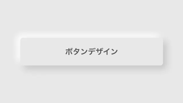
HTML・CSSでつくるおしゃれなボタンのデザイン35選
キラーページへのリンクや主要機能のトリガーとしてなど、重要な導線を表示するのに使われるボタン。どうせならよりクリックされるものにしたいですよね。そこで今回はシンプルなものからおしゃれなものまで、様々なボタンのデザインスニペットをまとめました。ぜひご自身のサイトと親和性の高いものをコピペで利用してみてください。
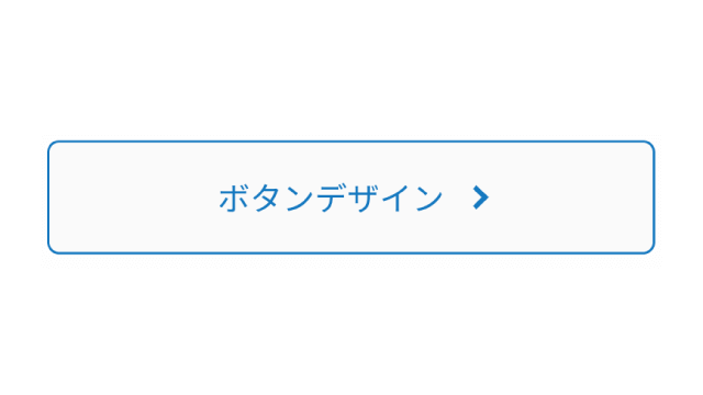
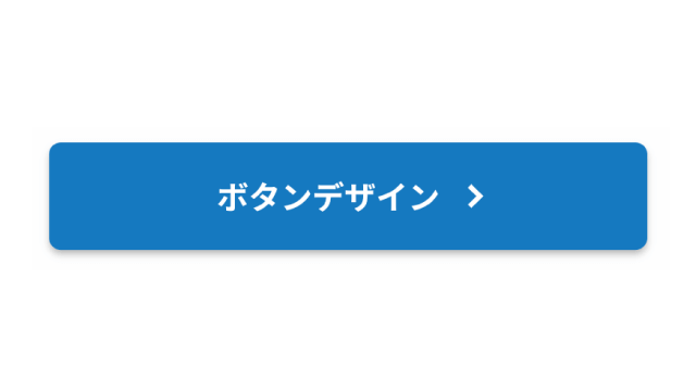
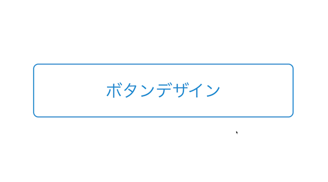
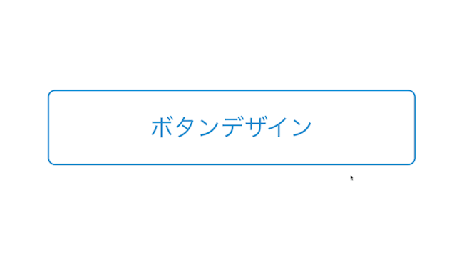
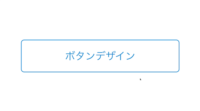
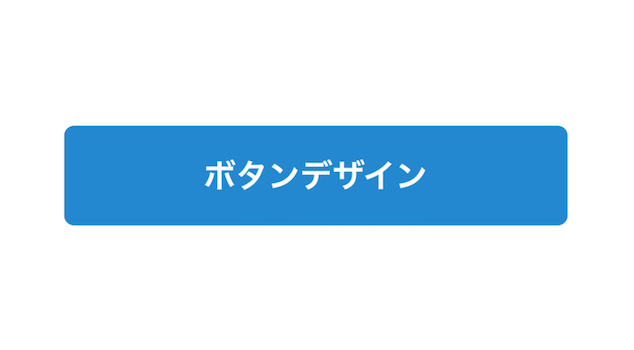
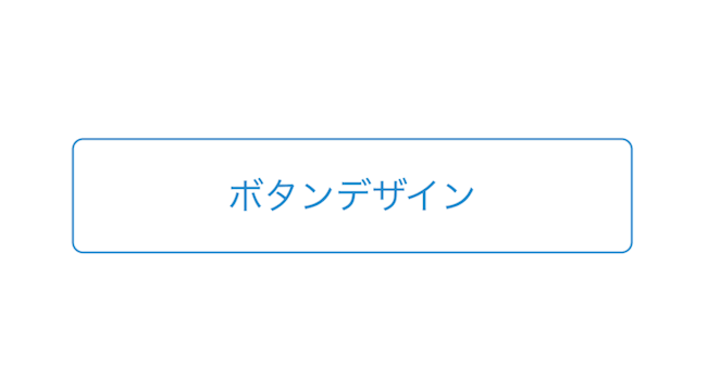
線状のボタン
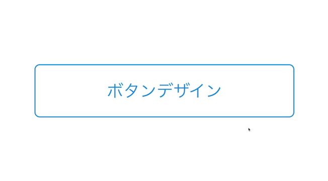
スタンダード
デザインを調整する
HTMLをコピペする
<button class="button-1">ボタンデザイン</button>
CSSをコピペする
          .button-1 {
    display: flex;
    justify-content: center;
    align-items: center;
    width: 250px;
    margin:0 auto;
    padding: .9em 2em;
    border: 1px solid #2589d0;
    border-radius: 5px;
    background-color: #fff;
    color: #2589d0;
    font-size: 1em;
}
細い矢印
デザインを調整する
HTMLをコピペする
<button class="button-54">ボタンデザイン</button>
CSSをコピペする
          .button-54 {
    display: flex;
    justify-content: center;
    align-items: center;
    position: relative;
    width: 250px;
    margin: 0 auto;
    padding: .9em 3em .9em 2em;
    border: 1px solid #2589d0;
    border-radius: 5px;
    background-color: #fff;
    color: #2589d0;
    font-size: 1em;
}

.button-54::after {
    position: absolute;
    right: 2em;
    transform: translateY(-50%);
    transform-origin: left;
    width: 2em;
    height: .5em;
    background-color: #2589d0;
    clip-path: polygon(0 100%, 100% 100%, 70% 40%, 70% 90%, 0% 90%);
    content: '';
    transition: transform .3s;
}

.button-54:hover::after {
    transform: translateY(-50%) scaleX(1.4);
}
交差する枠線
デザインを調整する
HTMLをコピペする
<button class="button-45">ボタンデザイン</button>
CSSをコピペする
          .button-45 {
    display: flex;
    justify-content: center;
    align-items: center;
    position: relative;
    width: 250px;
    margin: 0 auto;
    padding: .9em 2em;
    border-top: 1px solid #2589d0;
    border-right: none;
    border-bottom: 1px solid #2589d0;
    border-left: none;
    background-color: #fff;
    color: #2589d0;
    font-size: 1em;
}

.button-45::before,
.button-45::after {
    position: absolute;
    width: 1px;
    height: 140%;
    background-color: #2589d0;
    content: '';
}

.button-45::before {
    left: calc(3.1em / 5 - 1px);
}

.button-45::after {
    right: calc(3.1em / 5 - 1px);
}
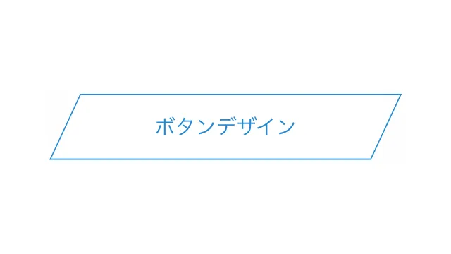
平行四辺形
デザインを調整する
「skew」で傾斜を付けたボタン。テキストを真っ直ぐのままにするために、疑似要素に傾斜を付けています。
HTMLをコピペする
<button class="button-39">ボタンデザイン</button>
CSSをコピペする
          .button-39 {
    display: flex;
    justify-content: center;
    align-items: center;
    position: relative;
    width: 250px;
    margin: 0 auto;
    padding: .9em 2em;
    border: none;
    background-color: #fff;
    color: #2589d0;
    font-size: 1em;
}

.button-39::before {
    position: absolute;
    transform: skewX(-25deg);
    width: 100%;
    height: 100%;
    border: 1px solid #2589d0;
    content: '';
}
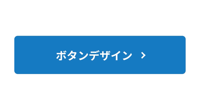
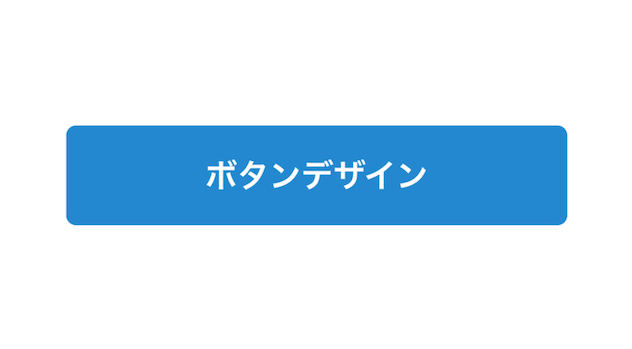
塗りつぶされたボタン

スタンダード
デザインを調整する
HTMLをコピペする
<button class="button-2">ボタンデザイン</button>
CSSをコピペする
          .button-2 {
    display: flex;
    justify-content: center;
    align-items: center;
    width: 250px;
    margin:0 auto;
    padding: .9em 2em;
    border: none;
    border-radius: 5px;
    background-color: #2589d0;
    color: #fff;
    font-weight: 600;
    font-size: 1em;
}

.button-2:hover {
    background-color: #1579c0;
}
シャドウ
デザインを調整する
HTMLをコピペする
<button class="button-3">ボタンデザイン</button>
CSSをコピペする
          .button-3 {
    display: flex;
    justify-content: center;
    align-items: center;
    width: 250px;
    margin:0 auto;
    padding: .9em 2em;
    border: none;
    border-radius: 5px;
    box-shadow: 0 2px 3px rgb(0 0 0 / 25%), 0 2px 3px -2px rgb(0 0 0 / 15%);
    background-color: #2589d0;
    color: #fff;
    font-weight: 600;
    font-size: 1em;
}

.button-3:hover {
    background-color: #1579c0;
}
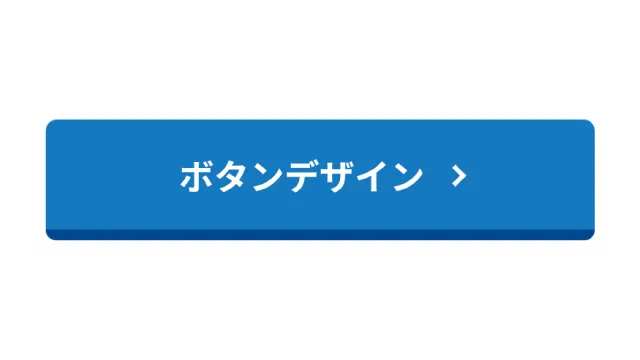
立体的
デザインを調整する
HTMLをコピペする
<button class="button-4">ボタンデザイン</button>
CSSをコピペする
          .button-4 {
    display: flex;
    justify-content: center;
    align-items: center;
    width: 250px;
    margin:0 auto;
    padding: .9em 2em;
    border: none;
    border-bottom: solid 5px #0059a0;
    border-radius: 5px;
    background-color: #2589d0;
    color: #fff;
    font-weight: 600;
    font-size: 1em;
    transition: .5s ease;
}

.button-4:hover {
    transform: translateY(3px);
    border-bottom-width: 2px;
}

内側に枠線
デザインを調整する
HTMLをコピペする
<button class="button-49">ボタンデザイン</button>
CSSをコピペする
          .button-49 {
    display: flex;
    justify-content: center;
    align-items: center;
    width: 250px;
    margin: 0 auto;
    padding: .9em 2em;
    border: 2px solid #fff;
    border-radius: 5px;
    box-shadow: 0 0 0 3px #2589d0;
    background-color: #2589d0;
    color: #fff;
    font-weight: 600;
    font-size: 1em;
}
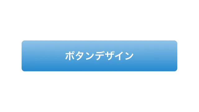
グラデーション (上下)
デザインを調整する
HTMLをコピペする
<button class="button-43">ボタンデザイン</button>
CSSをコピペする
          .button-43 {
    display: flex;
    justify-content: center;
    align-items: center;
    width: 250px;
    margin: 0 auto;
    padding: .9em 2em;
    border: none;
    border-radius: 5px;
    background-image: linear-gradient(0deg, #2589d0 0%, #2589d080 100%);
    color: #fff;
    font-weight: 600;
    font-size: 1em;
}

星アイコンのリボン
デザインを調整する
星アイコンをあしらったリボン付きのボタン。リボンの色が白なので、白背景にボタンを置く場合はシャドウを付けて立体的に見せるのがおすすめです。
HTMLをコピペする
<button class="button-50">ボタンデザイン</button>
CSSをコピペする
          .button-50 {
    display: flex;
    justify-content: center;
    align-items: center;
    position: relative;
    width: 250px;
    margin: 0 auto;
    padding: .9em 2em .8em 45px;
    border: none;
    border-radius: 5px;
    box-shadow: 0 2px 3px rgb(0 0 0 / 30%), 0 2px 3px -2px rgb(0 0 0 / 20%);
    background-color: #2589d0;
    color: #fff;
    font-weight: 600;
    font-size: 1em;
    transition: transform .3s ease-in-out, box-shadow .3s ease-in-out;
}

.button-50:hover {
    transform: translateY(-1px);
    box-shadow: 0 15px 30px -5px rgb(0 0 0 / 20%), 0 0 5px rgb(0 0 0 / 10%);
}

.button-50::before {
    position: absolute;
    top: 0;
    left: 15px;
    width: 30px;
    height: 85%;
    background-color: #fff;
    clip-path: polygon(0 0, 0 100%, 50% 75%, 100% 100%, 100% 0);
    content: '';
}

.button-50::after {
    position: absolute;
    top: 33%;
    left: 30px;
    transform: translate(-50%, -50%);
    color: #2589d0;
    font-size: 1.2em;
    content: '★';
}
アイコン付きのボタン

ページ上部へ戻る
デザインを調整する
HTMLをコピペする
          <button class="button-20">
    <svg xmlns="http://www.w3.org/2000/svg" viewBox="0 0 24 24" width="24" height="24">
        <path fill="#ffffff" d="m12.9 5.1 10.7 10.7c.5.5.5 1.4 0 1.9l-1.2 1.2c-.5.5-1.3.5-1.9 0L12 10.4l-8.5 8.5c-.5.5-1.3.5-1.9 0L.4 17.7c-.5-.5-.5-1.4 0-1.9L11.1 5.1c.5-.5 1.3-.5 1.8 0z"/>
    </svg>
</button>
CSSをコピペする
          .button-20 {
    display: flex;
    justify-content: center;
    align-items: center;
    width: 50px;
    height: 50px;
    border: none;
    border-radius: 50%;
    background-color: #2589d0;
}

.button-20:hover {
    border: 1px solid #2589d0;
    background-color: #fff;
}

.button-20:hover path {
    fill: #2589d0;
}

通知
デザインを調整する
HTMLをコピペする
          <button class="button-65">
    <svg xmlns="http://www.w3.org/2000/svg" viewBox="0 0 24 24">
        <path d="M22 20H2V18H3V11.0314C3 6.04348 7.02944 2 12 2C16.9706 2 21 6.04348 21 11.0314V18H22V20ZM9.5 21H14.5C14.5 22.3807 13.3807 23.5 12 23.5C10.6193 23.5 9.5 22.3807 9.5 21Z"></path>
    </svg>
    <span>2</span>
</button>
CSSをコピペする
          .button-65 {
    display: flex;
    justify-content: center;
    align-items: center;
    position: relative;
    width: 44px;
    height: 44px;
    border: none;
    border-radius: 50%;
    background-color: #f2f2f2;
}

.button-65 svg {
    width: 25px;
    height: 25px;
    fill: #aaaaaa;
}

.button-65 span {
    display: flex;
    justify-content: center;
    align-items: center;
    position: absolute;
    top: -15%;
    right: -15%;
    width: 20px;
    height: 20px;
    border-radius: 50%;
    background-color: #2589d0;
    color: #fff;
    font-size: .9em;
}

プラスアイコン
デザインを調整する
背景の円と共にプラスアイコンを付けてみました。背景の円は画像で、そしてアイコンはあえて疑似要素で表現することで「押下時に回転させてマイナスに変形させる」といった拡張も可能にしています。
HTMLをコピペする
<button class="button-61">ボタンデザイン</button>
CSSをコピペする
          .button-61 {
    display: flex;
    justify-content: center;
    align-items: center;
    position: relative;
    width: 250px;
    margin: 0 auto;
    padding: .9em 3.2em .9em 2em;
    border: none;
    border-radius: 5px;
    background-color: #2589d0;
    background-image: url(data:image/svg+xml;charset=utf8,%3Csvg%20xmlns%3D%22http%3A%2F%2Fwww.w3.org%2F2000%2Fsvg%22%20viewBox%3D%220%200%2028%2028%22%3E%0A%20%20%20%20%3Ccircle%20cx%3D%2214%22%20cy%3D%2214%22%20r%3D%2214%22%20style%3D%22fill%3A%23fff%3B%22%2F%3E%0A%3C%2Fsvg%3E);
    background-position: right 3em center;
    background-size: 1.2em;
    background-repeat: no-repeat;
    color: #fff;
    font-weight: 600;
    font-size: 1em;
}

.button-61:hover {
    background-color: #1579c0;
}

.button-61::before,
.button-61::after {
    position: absolute;
    right: calc(3.6em - 1.5px);
    width: 3px;
    height: 10px;
    border-radius: 1px;
    background-color: #2589d0;
    content: '';
}

.button-61::before {
    transform: rotate(90deg);
}

外部リンクアイコン
デザインを調整する
外部リンクのアイコンを付けたボタン。そのリンクが別タブで開くことを明示しておきたい場合におすすめです。
HTMLをコピペする
<button class="button-55">ボタンデザイン</button>
CSSをコピペする
          .button-55 {
    display: flex;
    justify-content: center;
    align-items: center;
    min-width: 250px;
    margin: 0 auto;
    padding: .9em 2em;
    border: none;
    border-radius: 5px;
    background-color: #2589d0;
    color: #fff;
    font-weight: 600;
    font-size: 1em;
}

.button-55::after {
    width: 1.25em;
    height: 1.25em;
    margin-left: 8px;
    background-image: url("data:image/svg+xml,%3Csvg xmlns='http://www.w3.org/2000/svg' viewBox='0 0 24 24'%3E%3Cpath d='M10 6V8H5V19H16V14H18V20C18 20.5523 17.5523 21 17 21H4C3.44772 21 3 20.5523 3 20V7C3 6.44772 3.44772 6 4 6H10ZM21 3V11H19L18.9999 6.413L11.2071 14.2071L9.79289 12.7929L17.5849 5H13V3H21Z' fill='%23fff'%3E%3C/path%3E%3C/svg%3E");
    content: '';
}

.button-55:hover {
    background-color: #1579c0;
}

メールアイコン
デザインを調整する
メールアイコンを付けたボタン。お問い合わせページへの導線などにどうぞ。
HTMLをコピペする
<button class="button-56">ボタンデザイン</button>
CSSをコピペする
          .button-56 {
    display: flex;
    justify-content: center;
    align-items: center;
    min-width: 250px;
    margin: 0 auto;
    padding: .9em 2em;
    border: none;
    border-radius: 5px;
    background-color: #2589d0;
    color: #fff;
    font-weight: 600;
    font-size: 1em;
}

.button-56:hover {
    background-color: #1579c0;
}

.button-56::after {
    width: 1.25em;
    height: 1.25em;
    margin-left: 8px;
    background-image: url("data:image/svg+xml,%3Csvg xmlns='http://www.w3.org/2000/svg' viewBox='0 0 24 24'%3E%3Cpath d='M3 3H21C21.5523 3 22 3.44772 22 4V20C22 20.5523 21.5523 21 21 21H3C2.44772 21 2 20.5523 2 20V4C2 3.44772 2.44772 3 3 3ZM12.0606 11.6829L5.64722 6.2377L4.35278 7.7623L12.0731 14.3171L19.6544 7.75616L18.3456 6.24384L12.0606 11.6829Z' fill='%23fff'%3E%3C/path%3E%3C/svg%3E");
    content: '';
}

お気に入り
デザインを調整する
HTMLをコピペする
<button class="button-64">ボタンデザイン</button>
CSSをコピペする
          .button-64 {
    display: flex;
    justify-content: center;
    align-items: center;
    min-width: 250px;
    margin: 0 auto;
    padding: .9em 2em;
    border: 1px solid #f1443e;
    border-radius: 5px;
    background-color: #fff;
    color: #f1443e;
    font-size: 1em;
}

.button-64:hover {
    background-color: f1443e;
}

.button-64::after {
    width: 1.25em;
    height: 1.25em;
    margin-left: 8px;
    background-image: url("data:image/svg+xml,%3Csvg xmlns='http://www.w3.org/2000/svg' viewBox='0 0 24 24'%3E%3Cpath d='M12.001 4.52853C14.35 2.42 17.98 2.49 20.2426 4.75736C22.5053 7.02472 22.583 10.637 20.4786 12.993L11.9999 21.485L3.52138 12.993C1.41705 10.637 1.49571 7.01901 3.75736 4.75736C6.02157 2.49315 9.64519 2.41687 12.001 4.52853ZM18.827 6.1701C17.3279 4.66794 14.9076 4.60701 13.337 6.01687L12.0019 7.21524L10.6661 6.01781C9.09098 4.60597 6.67506 4.66808 5.17157 6.17157C3.68183 7.66131 3.60704 10.0473 4.97993 11.6232L11.9999 18.6543L19.0201 11.6232C20.3935 10.0467 20.319 7.66525 18.827 6.1701Z' fill='%23f1443e'%3E%3C/path%3E%3C/svg%3E");
    content: '';
}
アニメーション付きのボタン
通り抜ける光
デザインを調整する
HTMLをコピペする
<button class="button-10">ボタンデザイン</button>
CSSをコピペする
          .button-10 {
    display: flex;
    justify-content: center;
    align-items: center;
    position: relative;
    width: 250px;
    margin: 0 auto;
    padding: 1em 2em;
    overflow: hidden;
    border: none;
    border-radius: 5px;
    background-color: #2589d0;
    color: #fff;
    font-weight: 600;
    font-size: 1em;
}

.button-10::before {
    display: block;
    position: absolute;
    top: -50%;
    left: -30%;
    transform: rotate(30deg);
    width: 70px;
    height: 100px;
    content: '';
    background-image: linear-gradient(left, rgba(255, 255, 255, 0) 0%, rgba(255, 255, 255, 1) 50%, rgba(255, 255, 255, 0) 100%);
    background-image: -webkit-gradient(linear, left bottom, right bottom, color-stop(0%, rgba(255, 255, 255, 0)), color-stop(50%, rgba(255, 255, 255, 1)), color-stop(100%, rgba(255, 255, 255, 0)));
    animation: animation-button-10 2s infinite linear;
}

@keyframes animation-button-10 {
    17% {
        left: 120%;
    }
    100% {
        left: 120%;
    }
}

.button-10:hover {
    background-color: #1579c0;
}

輝き
デザインを調整する
SVGを利用しボタン右上で星を光らせてみました。光を際立たせるためにも、背景色はできるだけ黒系統するのがおすすめです。
HTMLをコピペする
<button class="button-59">ボタンデザイン</button>
CSSをコピペする
          .button-59 {
    display: flex;
    justify-content: center;
    align-items: center;
    position: relative;
    min-width: 250px;
    margin: 3em auto;
    padding: .9em 2em;
    border: none;
    border-radius: 5px;
    background-color: #2589d0;
    color: #fff;
    font-weight: 600;
    font-size: 1em;
    animation: anim-button-59-bright 1.4s ease-out infinite;
}

.button-59:hover {
    background-color: #1579c0;
}

.button-59::before,
.button-59::after {
    position: absolute;
    top: -1.5em;
    right: -1.5em;
    width: 3em;
    height: 3em;
    content: '';
}

.button-59::before {
    border: 1px solid #ffffff33;
    border-radius: 50%;
    animation: anim-button-59-circle 1.4s linear infinite;
}

.button-59::after {
    background: url('data:image/svg+xml;charset=utf8,%3Csvg%20xmlns%3D%22http%3A%2F%2Fwww.w3.org%2F2000%2Fsvg%22%20viewBox%3D%220%200%20190%20247%22%3E%3Cpath%20d%3D%22M190%2C123.5c-90%2C3.6-92.2%2C6.5-95%2C123.5-2.8-117-5-119.9-95-123.5%2C90-3.6%2C92.2-6.5%2C95-123.5%2C2.8%2C117%2C5%2C119.9%2C95%2C123.5Z%22%20fill%3D%22%23fff%22%2F%3E%3C%2Fsvg%3E') no-repeat center;
    animation: anim-button-59-star 1.4s linear infinite;
    filter: opacity(.8);
}

@keyframes anim-button-59-bright{
    75% {
        filter: unset;
    }
    80% {
        filter: brightness(1.1);
    }
}

@keyframes anim-button-59-circle {
    0% {
        opacity: 0;
        transform: scale(0);
    }
    75% {
        opacity: 0;
    }
    80% {
        opacity: 1;
        transform: scale(1);
    }
    100% {
        opacity: 0;
        transform: scale(1.5);
    }
}

@keyframes anim-button-59-star {
    0% {
        opacity: 0;
        transform: scale(0);
    }
    75% {
        opacity: 0;
        transform: scale(0);
    }
    80% {
        opacity: 1;
    }
    85% {
        opacity: 1;
        transform: scale(1.5) rotate(50deg);
    }
    95% {
        opacity: 0;
        transform: scale(4) rotate(150deg);
    }
    100% {
        opacity: 0;
        transform: scale(0) rotate(80deg);
    }
}
ホバーで動くボタン
伸びる下線
デザインを調整する
HTMLをコピペする
<button class="button-51">ボタンデザイン</button>
CSSをコピペする
          .button-51 {
    display: flex;
    justify-content: center;
    position: relative;
    width: 200px;
    margin: 0 auto;
    padding: .9em 2em;
    border: none;
    border-bottom: 2px solid #e6edf3;
    background-color: transparent;
    color: #333;
    font-weight: 600;
    font-size: 1em;
}

.button-51::after {
    position: absolute;
    bottom: -3px;
    left: 0;
    transform: scaleX(0);
    transform-origin: center left;
    width: 100%;
    height: 2px;
    background-color: #2589d0;
    content: '';
    transition: transform .3s ease;
}

.button-51:hover::after {
    transform: scaleX(1);
}
色が反転
デザインを調整する
ホバーすると背景色が基調色となるボタン。シンプルながらもしっかりと目を引くことができます。
HTMLをコピペする
<button class="button-36">ボタンデザイン</button>
CSSをコピペする
          .button-36 {
    display: flex;
    justify-content: center;
    align-items: center;
    width: 250px;
    margin: 0 auto;
    padding: .9em 2em;
    border: 1px solid #2589d0;
    border-radius: 5px;
    background-color: #fff;
    color: #2589d0;
    font-size: 1em;
}

.button-36:hover {
    border: none;
    background-color: #2589d0;
    color: #fff;
    font-weight: 600;
}
横にスライド
デザインを調整する
背景が横からスライドしてくるボタン。矢印アイコンとの親和性も高めです。
HTMLをコピペする
<button class="button-29">ボタンデザイン</button>
CSSをコピペする
          .button-29 {
    display: flex;
    justify-content: center;
    align-items: center;
    position: relative;
    width: 250px;
    margin:0 auto;
    padding: .9em 2em;
    overflow: hidden;
    border: 1px solid #2589d0;
    border-radius: 5px;
    background-color: #fff;
    color: #2589d0;
    font-size: 1em;
}

.button-29:hover {
    background-color: transparent;
    color: #fff;
}

.button-29::before {
    position: absolute;
    top: 0;
    left: 0;
    z-index: -1;
    width: 0;
    height: 100%;
    background-color: #2589d0;
    content: '';
    transition: width .3s ease;
}

.button-29:hover::before {
    width: 100%;
}
狭まりながら塗りつぶす
デザインを調整する
HTMLをコピペする
<button class="button-31">ボタンデザイン</button>
CSSをコピペする
          .button-31 {
    display: flex;
    justify-content: center;
    align-items: center;
    position: relative;
    width: 250px;
    margin:0 auto;
    padding: .9em 2em;
    border: 1px solid #2589d0;
    border-radius: 5px;
    background-color: #fff;
    color: #2589d0;
    font-size: 1em;
    transition: box-shadow .3s ease;
}

.button-31:hover {
    box-shadow: inset #2589d0 0 0 0 2em;
    color: #fff;
}
対角線上に広がる
デザインを調整する
HTMLをコピペする
<button class="button-32">ボタンデザイン</button>
CSSをコピペする
          .button-32 {
    display: flex;
    justify-content: center;
    align-items: center;
    position: relative;
    width: 250px;
    margin:0 auto;
    padding: .9em 2em;
    overflow: hidden;
    border: 1px solid #2589d0;
    border-radius: 5px;
    background-color: #fff;
    color: #2589d0;
    font-size: 1em;
}

.button-32:hover {
    background-color: transparent;
    color: #fff;
}

.button-32::before {
    position: absolute;
    z-index: -1;
    transform: rotate(-30deg);
    width: 100%;
    height: 0;
    border-radius: 5px;
    background-color: #2589d0;
    content: '';
    transition: height .3s ease;
}

.button-32:hover::before {
    height: 350%;
}
波紋
デザインを調整する
HTMLをコピペする
<button class="button-30">ボタンデザイン</button>
CSSをコピペする
          .button-30 {
    display: flex;
    justify-content: center;
    align-items: center;
    position: relative;
    width: 250px;
    margin:0 auto;
    padding: .9em 2em;
    border: 1px solid #2589d0;
    border-radius: 5px;
    background-color: #fff;
    color: #2589d0;
    font-size: 1em;
}

.button-30:hover {
    animation: anima-button-30 1s;
}

@keyframes anima-button-30 {
    0% {
        box-shadow: 0 0 0 0 rgb(37 137 208 / 50%);
    }
    100% {
        box-shadow: 0 0 0 1.2em rgb(0 0 0 / 0%);
    }
}
枠線を描画
デザインを調整する
HTMLをコピペする
<button class="button-33">ボタンデザイン</button>
CSSをコピペする
          .button-33 {
    position: relative;
    width: 250px;
    margin: 0 auto;
    padding: .9em 2em;
    color: #2589d0;
    font-size: 1em;
}

.button-33::before,
.button-33::after {
    position: absolute;
    z-index: -1;
    width: 0;
    height: 1px;
    content: '';
}

.button-33::before {
    top: -1px;
    left: 0;
    border-top: 1px solid transparent;
    border-right: 1px solid transparent;
}

.button-33::after {
    bottom: 0;
    right: 0;
    border-bottom: 1px solid transparent;
    border-left: 1px solid transparent;
}

.button-33:hover::before,
.button-33:hover::after {
    width: 100%;
    height: 100%;
    border-color: #2589d0;
    transition: width .3s ease, height .3s .3s ease;
}
バウンド
デザインを調整する
HTMLをコピペする
<button class="button-41">ボタンデザイン</button>
CSSをコピペする
          .button-41 {
    display: flex;
    justify-content: center;
    align-items: center;
    width: 250px;
    margin: 0 auto;
    padding: .9em 2em;
    border: none;
    border-radius: 5px;
    background-color: #2589d0;
    color: #fff;
    font-weight: 600;
    font-size: 1em;
}

.button-41:hover {
    animation: anima-button-41 2s linear infinite;
}

@keyframes anima-button-41 {
    7% {
        transform: translateY(-15px);
    }
    15% {
        transform: translateY(0);
    }
    20% {
        transform: translateY(-7px);
    }
    25% {
        transform: translateY(0);
    }
}
震える
デザインを調整する
HTMLをコピペする
<button class="button-38">ボタンデザイン</button>
CSSをコピペする
          .button-38 {
    display: flex;
    justify-content: center;
    align-items: center;
    width: 250px;
    margin: 0 auto;
    padding: .9em 2em;
    border: none;
    border-radius: 5px;
    background-color: #2589d0;
    color: #fff;
    font-weight: 600;
    font-size: 1em;
}

.button-38:hover {
    animation: anime-button-38 .3s linear infinite;
}

@keyframes anime-button-38 {
    20% {
        transform: translate(-2px, 2px);
    }
    40% {
        transform: translate(-2px, -2px);
    }
    60% {
        transform: translate(2px, 2px);
    }
    80% {
        transform: translate(2px, -2px);
    }
}
クリックで動くボタン
ローディング
デザインを調整する
クリックするとローディングアニメーションが表示されるボタン。JavaScriptを使わないので、単純なリンクとしてボタンを設置する際などにおすすめです。
HTMLをコピペする
<button class="button-37">ボタンデザイン</button>
CSSをコピペする
          .button-37 {
    display: flex;
    justify-content: center;
    align-items: center;
    position: relative;
    width: 250px;
    margin: 0 auto;
    padding: .9em 2em;
    border: 1px solid #2589d0;
    border-radius: 5px;
    background-color: #fff;
    color: #2589d0;
    font-size: 1em;
}

.button-37:focus {
    color: transparent;
}

.button-37:focus::before {
    display: flex;
    justify-content: center;
    align-items: center;
    position: absolute;
    width: 100%;
    height: 100%;
    background: url('data:image/svg+xml;charset=utf8,%3Csvg%20xmlns%3D%22http%3A%2F%2Fwww.w3.org%2F2000%2Fsvg%22%20viewBox%3D%220%200%2032%2032%22%20width%3D%2248%22%20height%3D%2248%22%20fill%3D%22%232589d0%22%3E%20%3Cpath%20d%3D%22M14%200%20H18%20V8%20H14%20z%22%20transform%3D%22rotate(0%2016%2016)%22%20opacity%3D%22.1%22%3E%20%3Canimate%20attributeName%3D%22opacity%22%20from%3D%221%22%20to%3D%22.1%22%20begin%3D%220%22%20dur%3D%221s%22%20repeatCount%3D%22indefinite%22%2F%3E%20%3C%2Fpath%3E%20%3Cpath%20d%3D%22M14%200%20H18%20V8%20H14%20z%22%20transform%3D%22rotate(45%2016%2016)%22%20opacity%3D%22.1%22%3E%20%3Canimate%20attributeName%3D%22opacity%22%20from%3D%221%22%20to%3D%22.1%22%20begin%3D%220.125s%22%20dur%3D%221s%22%20repeatCount%3D%22indefinite%22%2F%3E%20%3C%2Fpath%3E%20%3Cpath%20d%3D%22M14%200%20H18%20V8%20H14%20z%22%20transform%3D%22rotate(90%2016%2016)%22%20opacity%3D%22.1%22%3E%20%3Canimate%20attributeName%3D%22opacity%22%20from%3D%221%22%20to%3D%22.1%22%20begin%3D%220.25s%22%20dur%3D%221s%22%20repeatCount%3D%22indefinite%22%2F%3E%20%3C%2Fpath%3E%20%3Cpath%20d%3D%22M14%200%20H18%20V8%20H14%20z%22%20transform%3D%22rotate(135%2016%2016)%22%20opacity%3D%22.1%22%3E%20%3Canimate%20attributeName%3D%22opacity%22%20from%3D%221%22%20to%3D%22.1%22%20begin%3D%220.375s%22%20dur%3D%221s%22%20repeatCount%3D%22indefinite%22%2F%3E%20%3C%2Fpath%3E%20%3Cpath%20d%3D%22M14%200%20H18%20V8%20H14%20z%22%20transform%3D%22rotate(180%2016%2016)%22%20opacity%3D%22.1%22%3E%20%3Canimate%20attributeName%3D%22opacity%22%20from%3D%221%22%20to%3D%22.1%22%20begin%3D%220.5s%22%20dur%3D%221s%22%20repeatCount%3D%22indefinite%22%2F%3E%20%3C%2Fpath%3E%20%3Cpath%20d%3D%22M14%200%20H18%20V8%20H14%20z%22%20transform%3D%22rotate(225%2016%2016)%22%20opacity%3D%22.1%22%3E%20%3Canimate%20attributeName%3D%22opacity%22%20from%3D%221%22%20to%3D%22.1%22%20begin%3D%220.625s%22%20dur%3D%221s%22%20repeatCount%3D%22indefinite%22%2F%3E%20%3C%2Fpath%3E%20%3Cpath%20d%3D%22M14%200%20H18%20V8%20H14%20z%22%20transform%3D%22rotate(270%2016%2016)%22%20opacity%3D%22.1%22%3E%20%3Canimate%20attributeName%3D%22opacity%22%20from%3D%221%22%20to%3D%22.1%22%20begin%3D%220.75s%22%20dur%3D%221s%22%20repeatCount%3D%22indefinite%22%2F%3E%20%3C%2Fpath%3E%20%3Cpath%20d%3D%22M14%200%20H18%20V8%20H14%20z%22%20transform%3D%22rotate(315%2016%2016)%22%20opacity%3D%22.1%22%3E%20%3Canimate%20attributeName%3D%22opacity%22%20from%3D%221%22%20to%3D%22.1%22%20begin%3D%220.875s%22%20dur%3D%221s%22%20repeatCount%3D%22indefinite%22%2F%3E%20%3C%2Fpath%3E%3C%2Fsvg%3E') no-repeat center / 1.7em;
    content: '';
}
その他のボタン
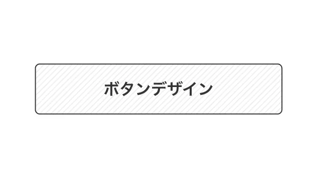
ストライプ背景 & 枠線
デザインを調整する
HTMLをコピペする
<button class="button-44">ボタンデザイン</button>
CSSをコピペする
          .button-44 {
    display: flex;
    justify-content: center;
    align-items: center;
    width: 250px;
    margin: 0 auto;
    padding: .9em 2em;
    border: 1px solid #333333;
    border-radius: 5px;
    background-image: repeating-linear-gradient(-45deg, #eee, #eee 1px, #ffffff 1px, #ffffff 4px);
    color: #333333;
    font-weight: 600;
    font-size: 1em;
    transition: box-shadow .3s;
}

.button-44:hover {
    box-shadow: 0 7px 30px -5px rgb(0 0 0 / 20%);
}
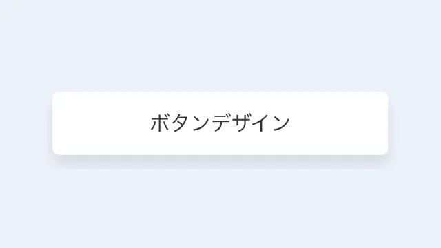
白背景 & シャドウ
デザインを調整する
HTMLをコピペする
<button class="button-40">ボタンデザイン</button>
CSSをコピペする
          .button-40 {
    display: flex;
    justify-content: center;
    align-items: center;
    position: relative;
    width: 250px;
    margin: 0 auto;
    padding: .9em 2em;
    border: none;
    border-radius: 5px;
    box-shadow: 0 7px 10px rgb(0 0 0 / 10%);
    background-color: #fff;
    color: #333;
    font-size: 1em;
    transition: transform .3s, box-shadow .3s;
}

.button-40:hover {
    transform: translateY(-2px);
    box-shadow: 0 7px 10px rgb(0 0 0 / 15%);
}
ニューモーフィズム風
デザインを調整する
HTMLをコピペする
<button class="button-21">ボタンデザイン</button>
CSSをコピペする
          .button-21 {
    display: flex;
    justify-content: center;
    align-items: center;
    width: 250px;
    padding: 1em 2em;
    border: 1px solid #e7e7e7;
    border-radius: 5px;
    box-shadow: 6px 6px 12px #c5c5c5, -6px -6px 12px #fff;
    background-color: #e7e7e7;
    color: #555555;
    font-weight: 600;
}

.button-21:hover {
    box-shadow: inset 4px 4px 12px #c5c5c5, inset -4px -4px 12px #fff;
}

コントラスト強め
デザインを調整する
HTMLをコピペする
          <button class="button-14">
    <span>ボタン</span>
</button>
CSSをコピペする
          .button-14,
.button-14 span {
    display: flex;
    justify-content: center;
    align-items: center;
}

.button-14 {
    position: relative;
    width: 250px;
    margin: 0 auto;
    padding: 0;
    border-radius: 5px;
    border: none;
    font-size: 1em;
}

.button-14::before {
    position: absolute;
    top: 7px;
    z-index: -1;
    width: 100%;
    height: 100%;
    border: 2px solid #000;
    border-radius: inherit;
    box-sizing: inherit;
    box-shadow: 0 5px 0 0 rgba(0, 0, 0, .2);
    background-color: #cfcf00;
    content: '';
}

.button-14 span {
    width: 100%;
    padding: .9em 2em;
    border: 2px solid #000;
    border-radius: inherit;
    background-color: #ffff00;
    color: #000;
    font-weight: 600;
    line-height: 1.5;
}

.button-14 span::after {
    display: inline-block;
    transform: rotate(45deg);
    width: 5px;
    height: 5px;
    margin-left: 10px;
    border-top: 2px solid #000;
    border-right: 2px solid #000;
    content: '';
}

.button-14:hover::before {
    transition: box-shadow .2s;
    box-shadow: 0 3px 0 0 rgba(0, 0, 0, .2);
}

.button-14:hover span {
    transition: transform .2s;
    transform: translateY(2px);
}

クラシカル
デザインを調整する
古めのOSのUIを彷彿とさせる、クラシックなデザインのボタン。使い勝手に関しては微妙ですが、遊び心を入れたい方にはおすすめです。
HTMLをコピペする
<button class="button-47">ボタンデザイン</button>
CSSをコピペする
          .button-47 {
    display: flex;
    justify-content: center;
    align-items: center;
    width: 150px;
    margin: 0 auto;
    padding: .5em 1em;
    border: none;
    box-shadow: inset -1px -1px #333, inset 1px 1px #fff, inset -2px -2px #999, inset 2px 2px #ffffff;
    background-color: #c0c0c0;
    color: #333;
    font-size: 1em;
    outline: 1px dotted #333;
    outline-offset: -4px;
}

.button-47:active {
    box-shadow: inset -1px -1px #fff, inset 1px 1px #333, inset -2px -2px #ffffff, inset 2px 2px #999;
}
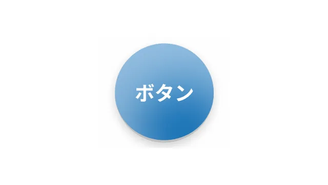
リアルな円形
デザインを調整する
HTMLをコピペする
<button class="button-13">ボタンデザイン</button>
CSSをコピペする
          .button-13 {
    width: 80px;
    height: 80px;
    border: none;
    border-bottom: solid 2px #c0c0c0;
    border-radius: 50%;
    box-shadow: inset 15px 30px 40px rgba(255, 255, 255, 0.5), 0 3px 7px rgba(0, 0, 0, .2);
    background-image: linear-gradient(#1579c0 0%, #0569b0 100%);
    color: #ffffff;
    font-weight: 600;
    font-size: 1em;
}
凹凸感強め
デザインを調整する
HTMLをコピペする
          <button class="button-46">
    <span>ボタン</span>
</button>
CSSをコピペする
          .button-46 {
    display: flex;
    justify-content: center;
    align-items: center;
    width: 80px;
    height: 80px;
    padding: 8px;
    border: none;
    border-radius: 50%;
    box-shadow: 0 10px 10px rgb(0 0 0 / 20%);
    background-image: linear-gradient(0, #ddd, #fff);
    color: #333333;
    font-weight: 600;
    font-size: .9em;
    transition: transform .3s, box-shadow .3s;
}

.button-46:hover {
    transform: scale(.99);
    box-shadow: 0 5px 5px rgb(0 0 0 / 20%);
}

.button-46 span {
    width: 100%;
    height: 100%;
    border-radius: 50%;
    background-image: linear-gradient(0, #fff, #ddd);
    line-height: 64px;
}